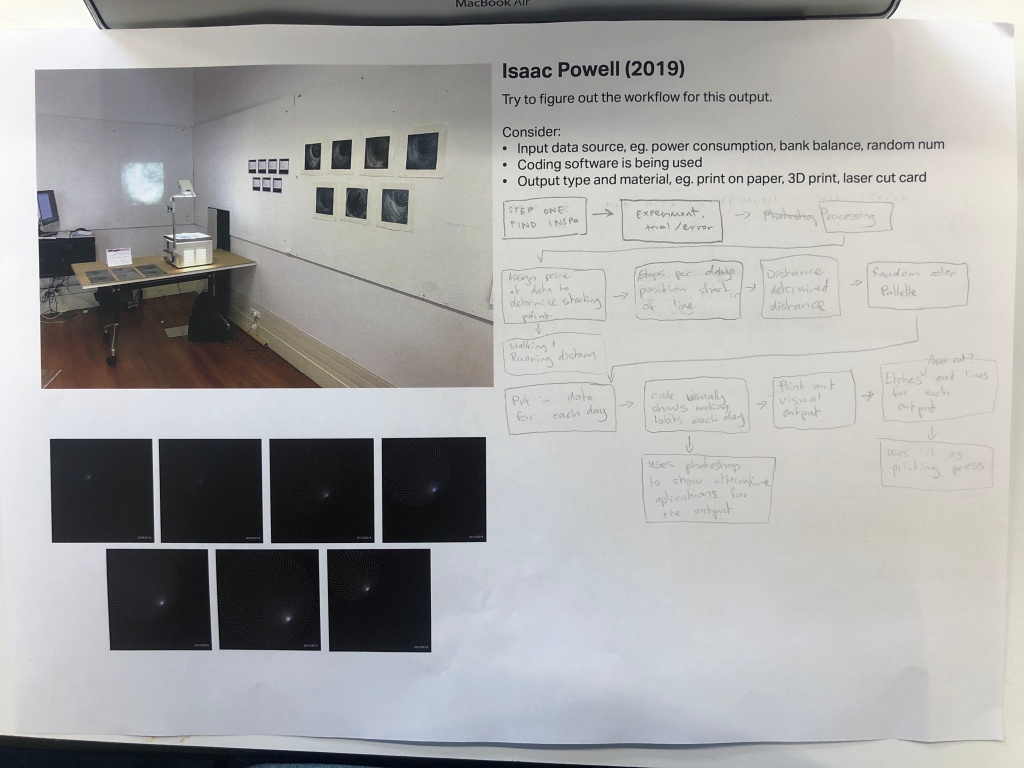
Class started with looking at the second assignment and looking at past projects which was really cool to see. In groups we were each given a past project and tried to work out the workflow/steps taken to get to the final stage. This helps us to understand the use of different design methods, media and the specific requirements needed in order for them to work. My group looked at Isaac Powell’s project.
https://isaacpowell0.tumblr.com/
Below is what we came up with. I really liked what his final result was. He made it clear how his code was used to create something physical. At first, it was confusing but with a deeper dive and investigation, it became more clear. From first glance, it was unclear as to what the image was trying to show eventually we worked out that it was data that he took from his health app on his phone in regards to his walking + running distance, steps, flights climbed and that date. The painted series was a little unclear but once we found out that his data had been taken, etched and printed the image end results became a little more clear to understand but below is the data in black and blue. Each line length, position conspire with a set of data.
What we did in class 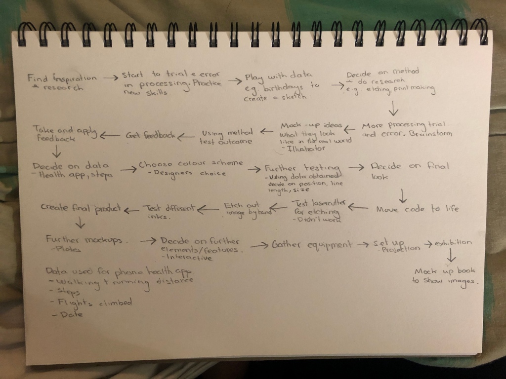
What I did at home
We next had a look at the examples that are on Processing which was a big help with exporting.
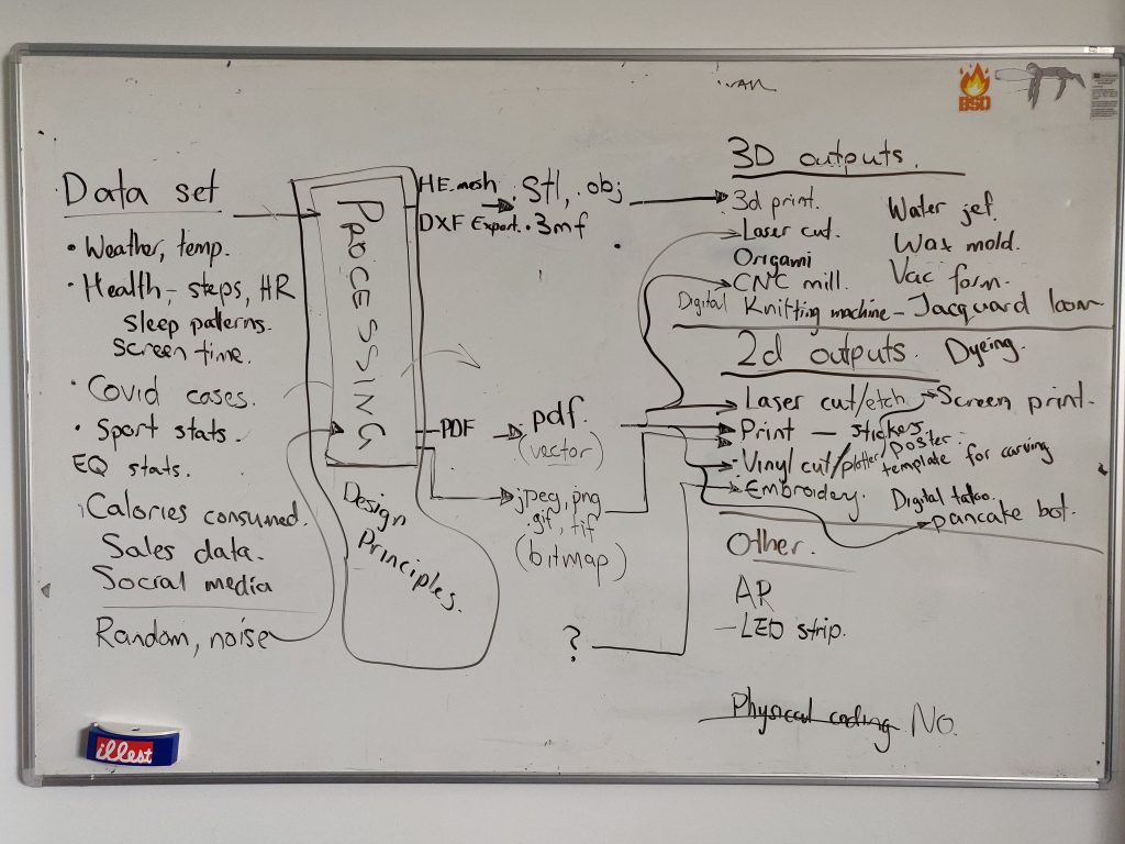
As a class, we looked at possible sets of data we could use and then bring into Processing. Keeping in mind of design principles as we work. We learnt about what different export files we need for different systems. We got to discuss different physical outcomes that we could use. Personally, I like the sound of digital embroidery and vinyl cutting. Having done printmaking before, etching like what Isaac did also seems fun and so did doing something like a poster or a book.
3D output:
3D print, water jet, laser cut, wax mould, origami, vac form, CNC mill, digital knitting machine, jacquard loom.
2D outputs:
Laser cut/etch, screen print, print – stickers, poster, template for carving, booklet , vinyl cut/plotter, embroidery, digital tattoo, pancake bot, dyeing.
Other:
AR, LED strip.
Physical coding = No
PRINTING:
Pdf (vector) – Can scale up and down
.bitmap (raster)
jpeg, png, gif, tif (bitmap)
stl, obj, 3mf (3D print)
jan, jef, sew (embroidery) – https://www.janome.com/learn/software-lessons/digitizer-jr.-version-3/what-are-the-embroidery-file-formats/
Processing has “example” folders.
Processing has “libraries” that you can import. – HE.mesh, DXF export.3mf
Data set
Weather, temp, health, steps, heart rate, sleep pattern, screen time, covid cases, sport stats, earthquake stats, calories consumed, sales data, social media. Random, noise.
Design principles
Contrast, movement (visual flow), scale and proportion , rhythm (repetition), balance(symmetry and asymmetry), perspective.
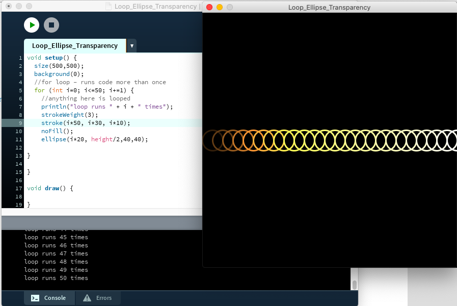
We got to have a go and try and make different images using the loop for function/for if statements.
for( init; test; update) – 3 parameters separated by “;”
for(int i= 0; i < 10; i ++ )
int i = 5; i <15 ; i +=2;
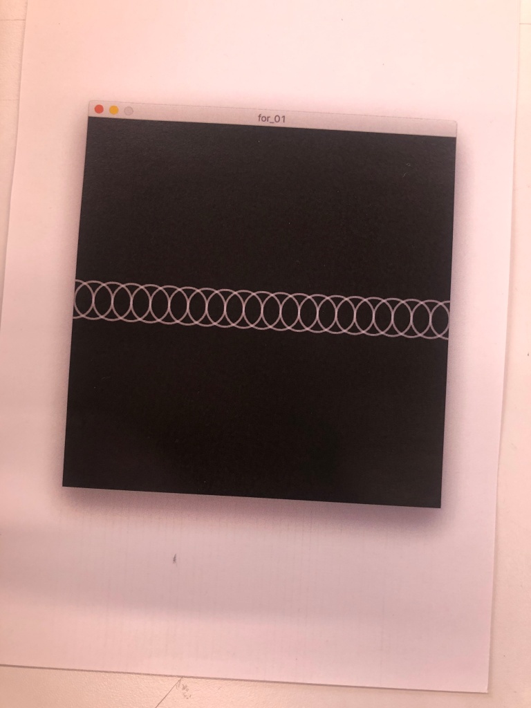
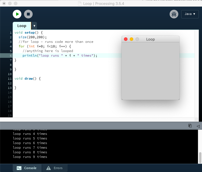
As a class we started by entering the code. Above I made sure that println was working 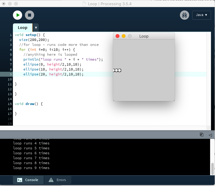
Next, we started to place the ellipses 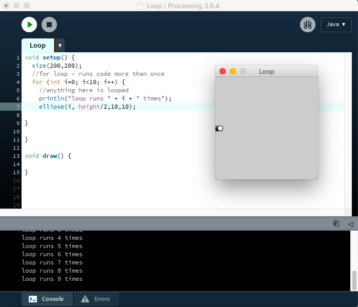
We then changed the
float: x-coordinate of the ellipse to i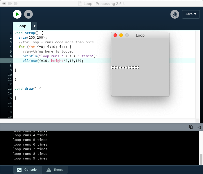
You can see here we added +10 onto i and it even out the circles 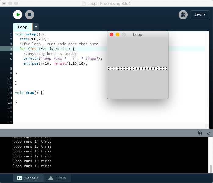
Adjusted the test parameters 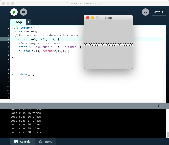
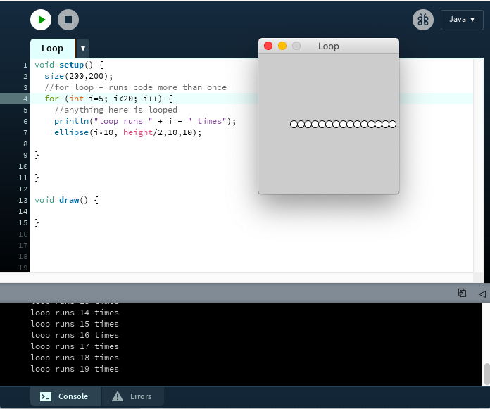
Using the init I was able to change the starting point 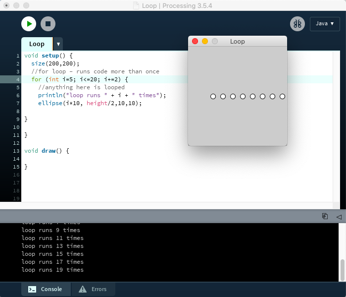
Instead of it being i++ it has been changed to i+=2 which creates a gap the size of on ellipse between each of the ellipses 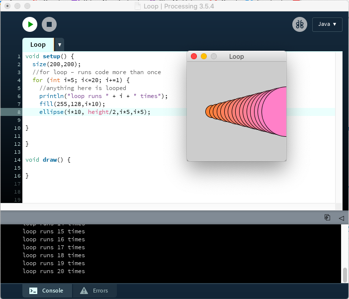
Using the reference image above I started to try to create it. I started by adding some colour, the direction it will go in 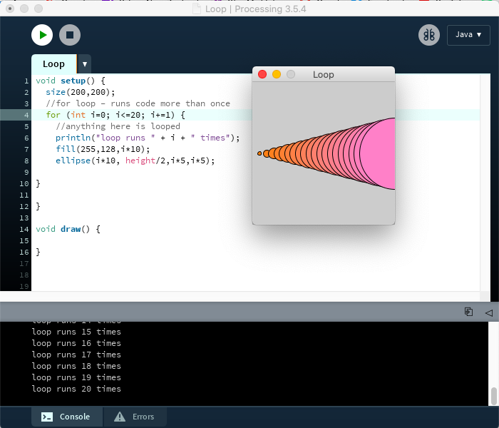
Changed the starting position 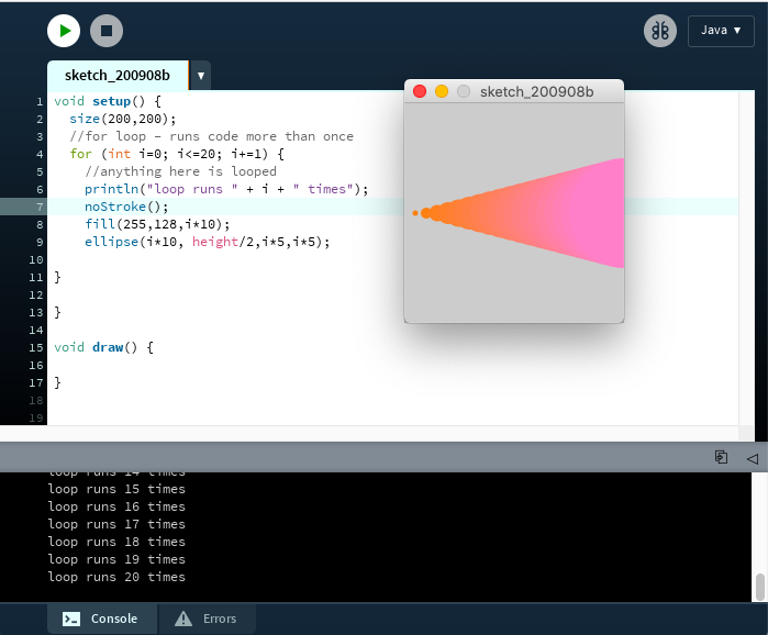
Removed the outline. It looks like a beam of colour 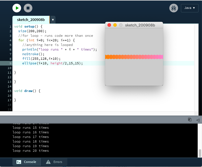
The size growing wasn’t working so I changed the I width and height to the same number so that the ellipses don’t grow 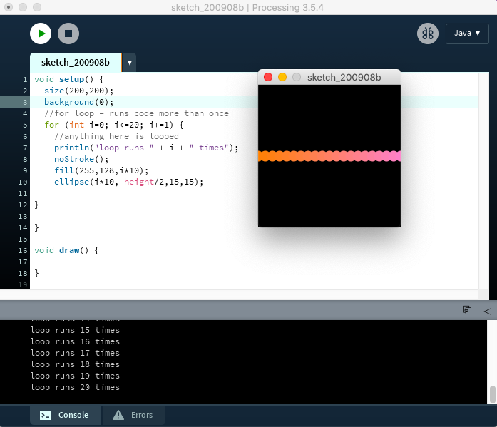
Changed the bacground 
Set a stroke 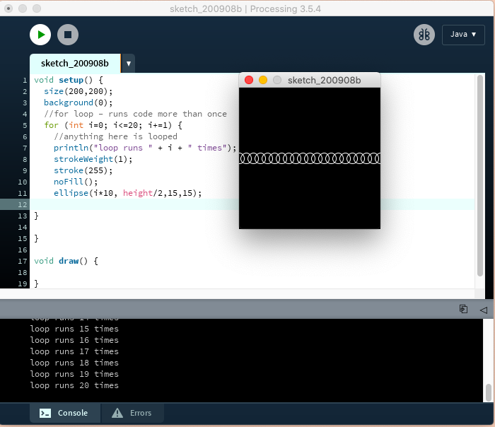
Remove fill, change stroke weight 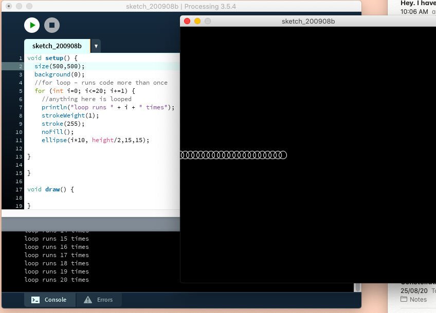
Changed the size 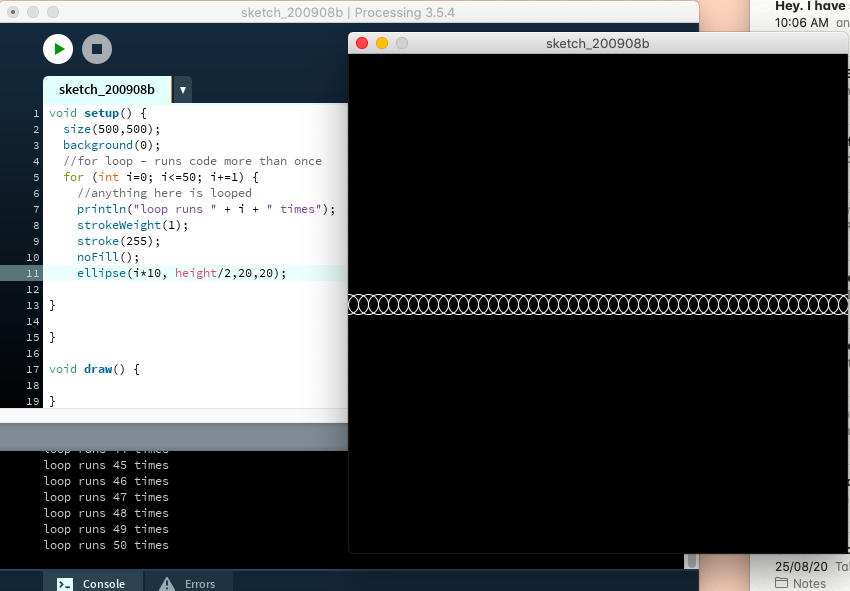
Made the ellipses fit the size better 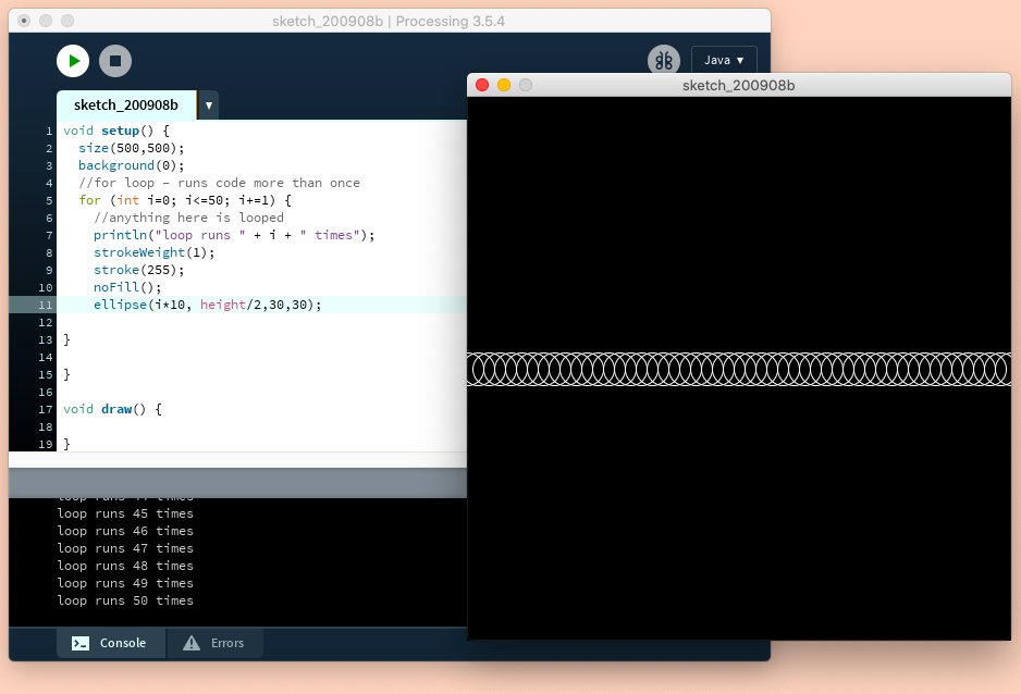
Changing the size of the ellipses 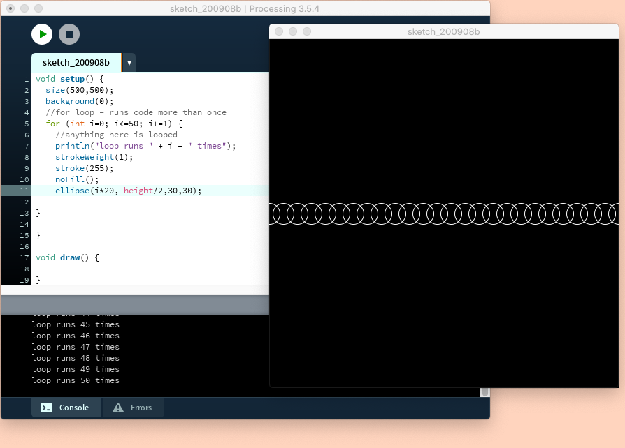
Changing the spacing 
Playing with transparency 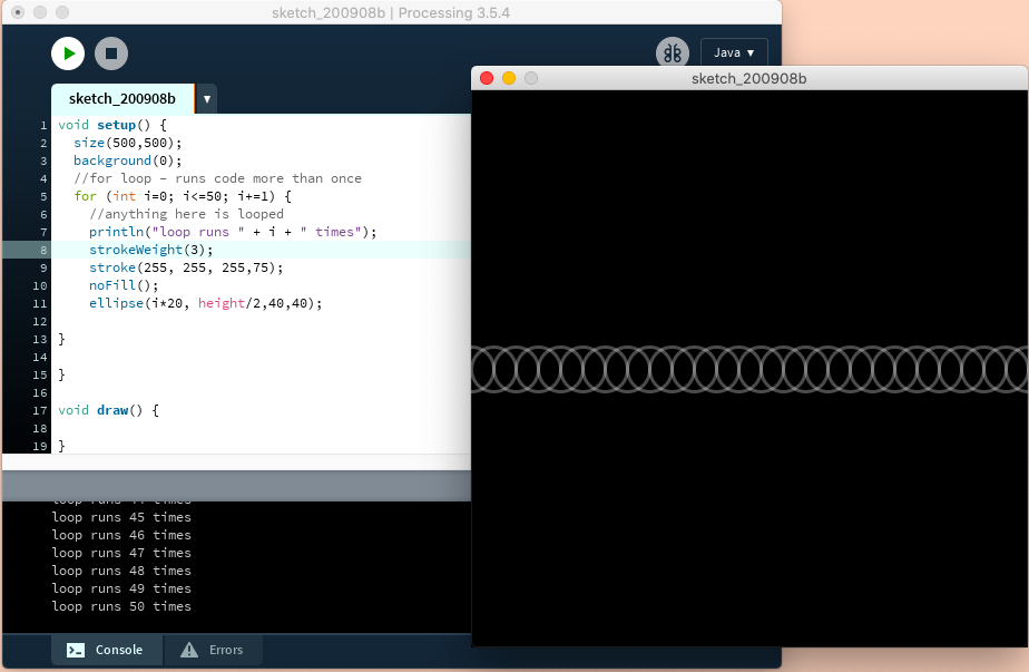
Increased stroke weight. Success! 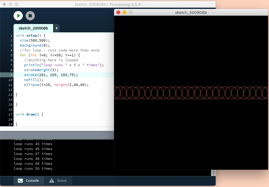
Playing with colour 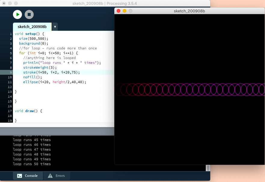
Wanting to create a gradient 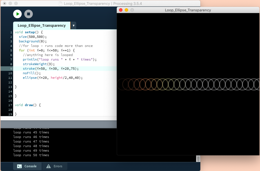
Quite like this look 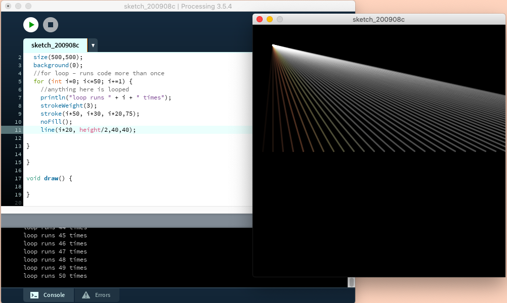
Wanted to see what it looks like as lines. Reminds me of light spectrum 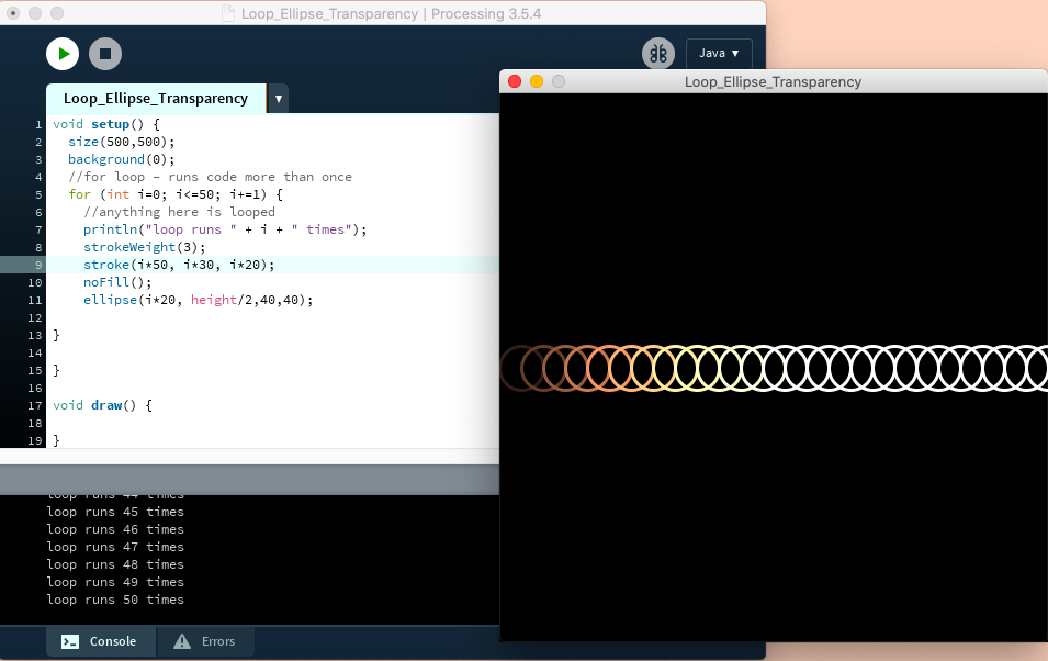
Decided to take the transparency off to make the colours pop more but couldn’t get it quite to go all the way so that there is less white and more colour.
Went home to see if I could improve the colour gradient and it sort of worked by changing the stroke 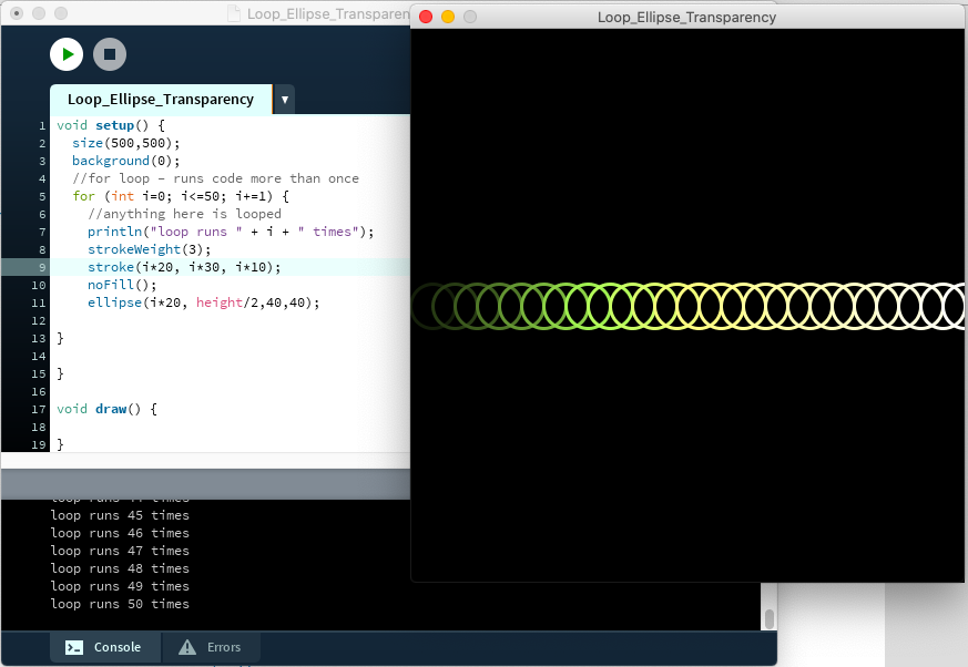
Had a go with another set of colours 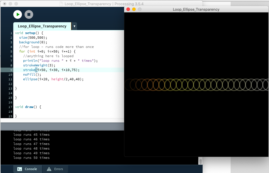
Turned the transparency back on
Coding Notes (from class) –
Physical output, taking the code outside of the computer
- 1 piece of work plus blog
- Discus where in the world you would see your design, what is its purpose? Photoshop it into where it would be seen. Is it a building or a repetitive pattern?
- Creative code out in the real world
- PDF (vector) vs bitmap (re
- Vector is good for large
- Go to examples in processing to see how to export a PDF
- beginRecord (tell It what you want it to save as, name of file)
- Saves in Processing Sketch
- A PDF is scaleable without losing quality
- mousePressed PDF code is good when you want them to interact with and then when the mouse is pressed it saves
- Random book if to float can be replaced with your code
- Go through them all and see what one works for you e.g. multiple PDFs
- Check out Processing library
- HE_Mesh for 3D, PEmborider for embroidery
- .dst for embroidery
- Create some data
- Data set is an option
- Colours and things can be chosen as a designer and from design principles
- Do it with purpose
- String is used for words
for (init; test; update) {
statements
}
- Int can be written as I or another letter or word. This tells the code where to start
- Test = number of times the code runs
- Update = Everytime the for loop runs, go up one (I++ or I+=2 will go up 2 at a time)
- No delay in the loop
Possible idea –
Turning pain into beauty (mental health). What shape resembles mental health/illness. Tell a story through code
Processing Examples –
I decided to have a play around with the examples in Processing. I love what can be done in processing and that it provides examples for you and provides you with an explanation but a lot of the code I am still not sure I understand but that will come with practice.
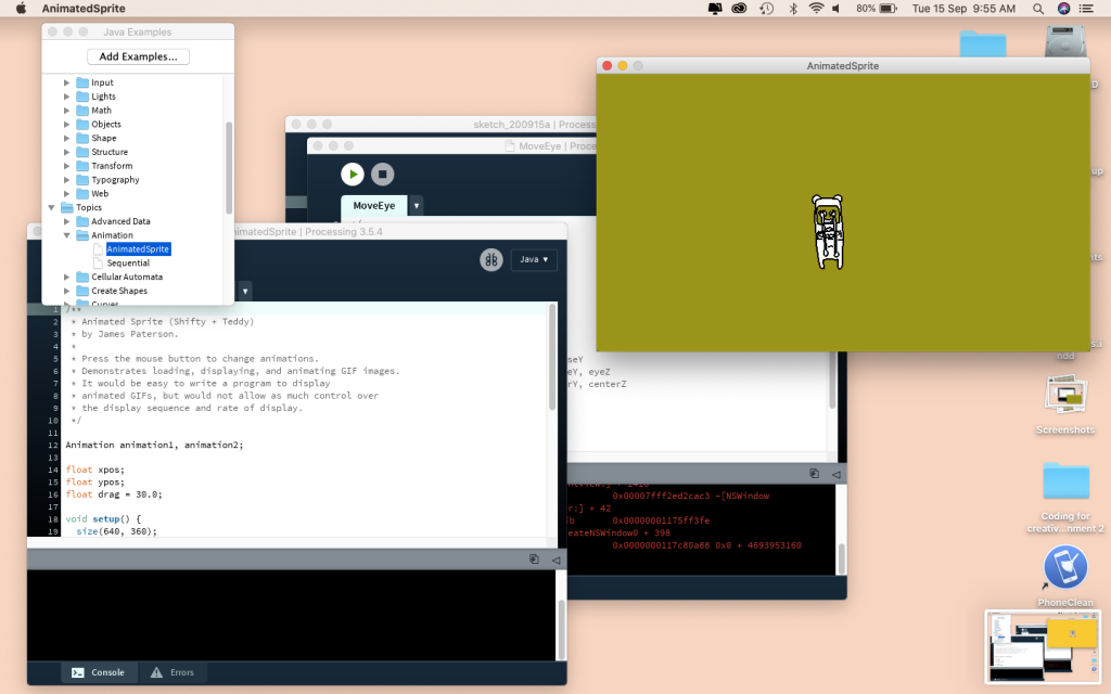
This one had an animation 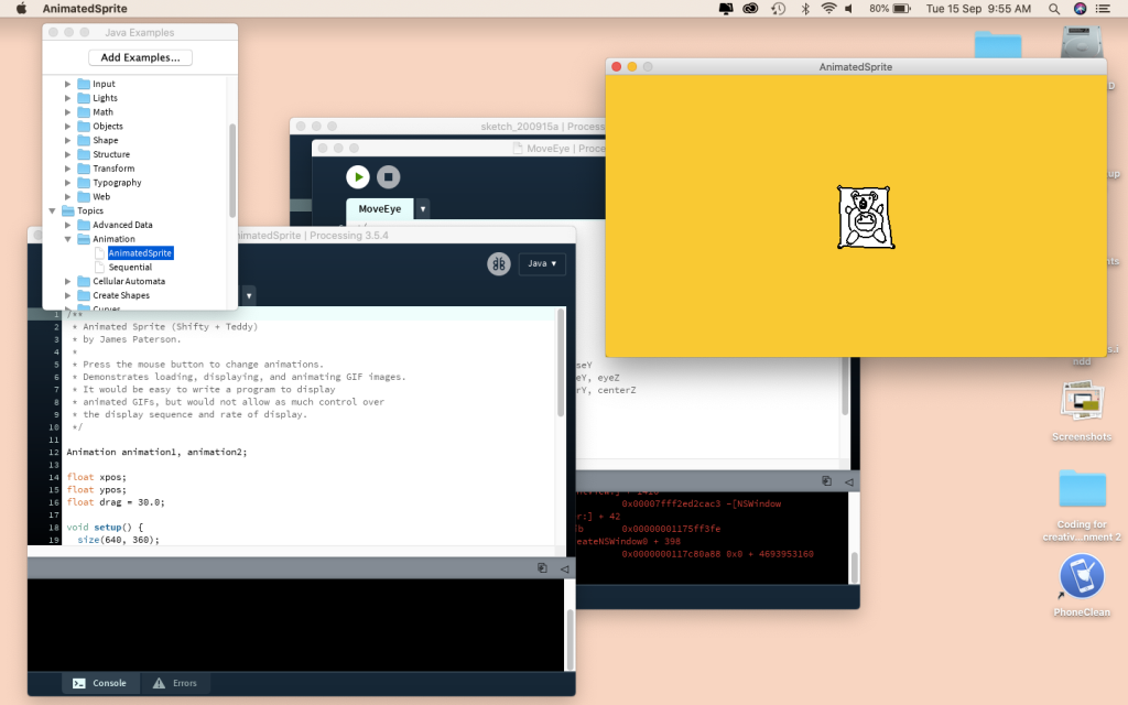
It would follow your mouse 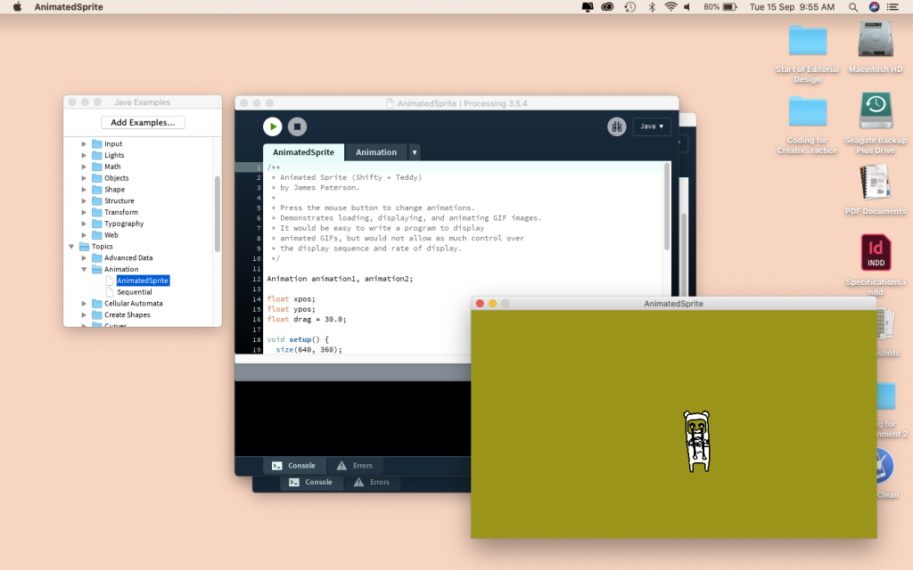
When the mouspressed is used it changes the animation 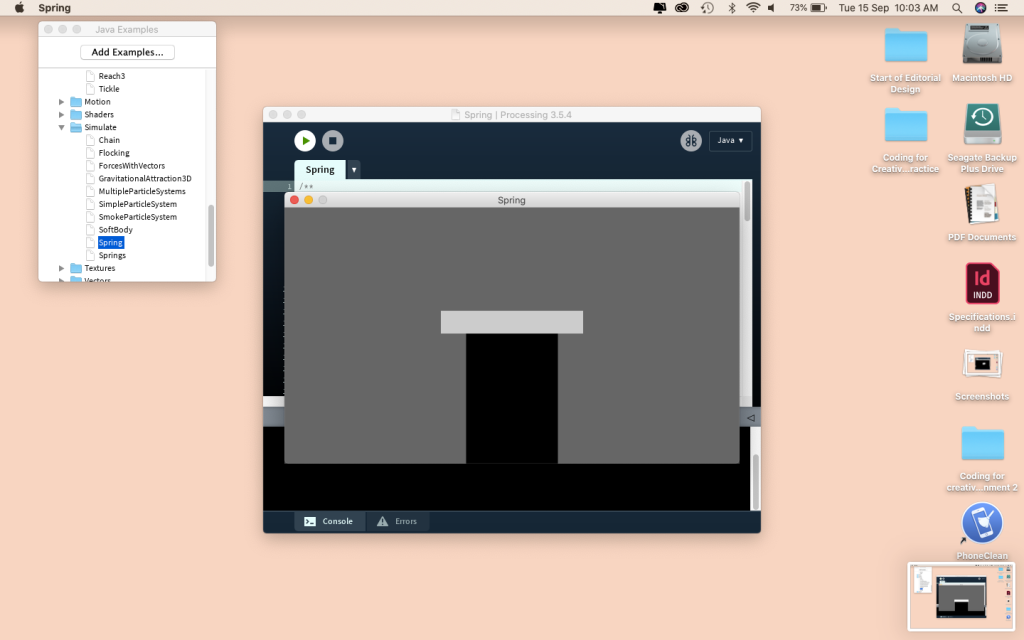
This one you could move up and down 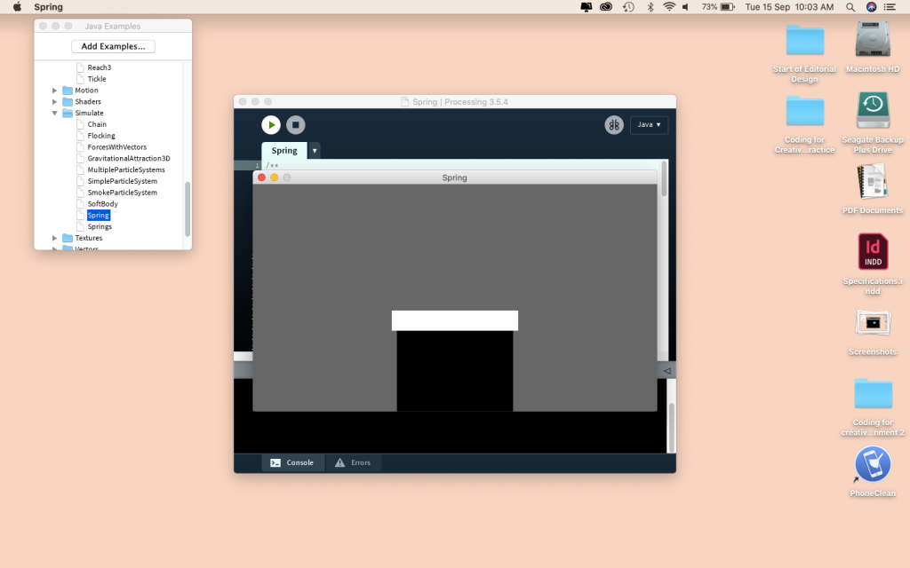
When let go it would bounce like a spring (hence the name) 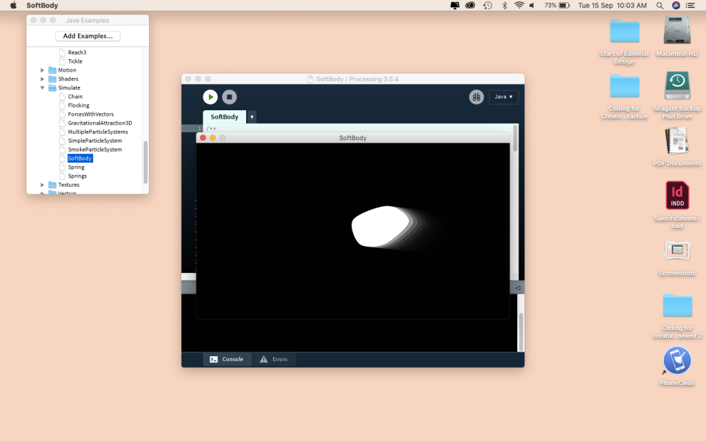
This one reminds me of a comet. It follows the mouse with some speed behind it 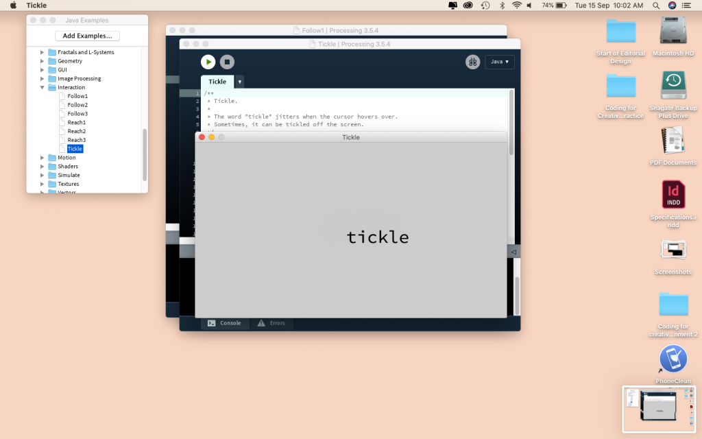
This one you can tickle the world tickle. When the mouse isn’t on it, it stays still 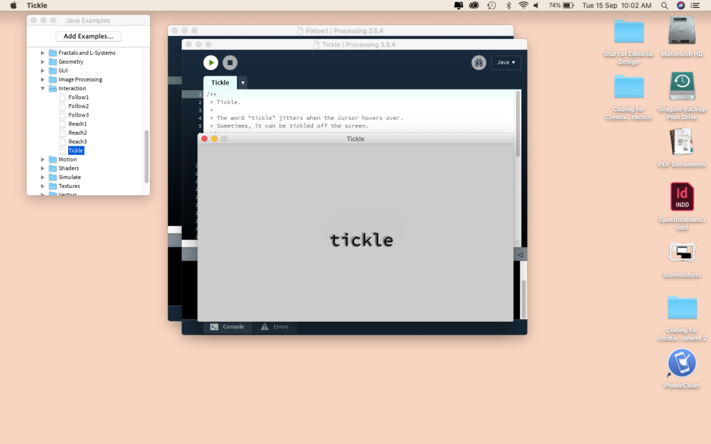
When the mouse is on the word tickle it vibrates and moves 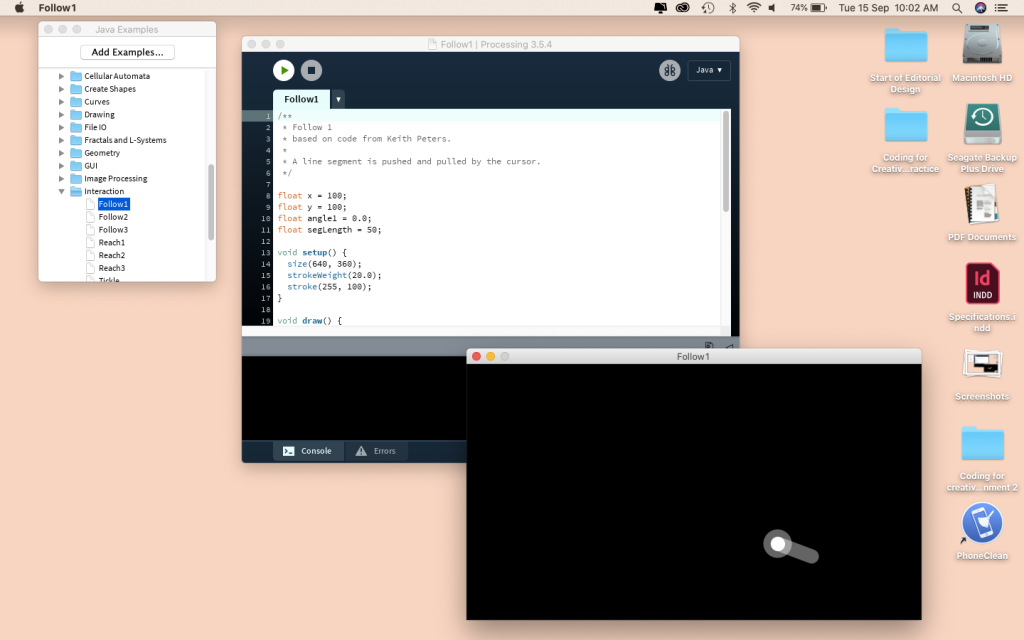
This is one follows the cursor 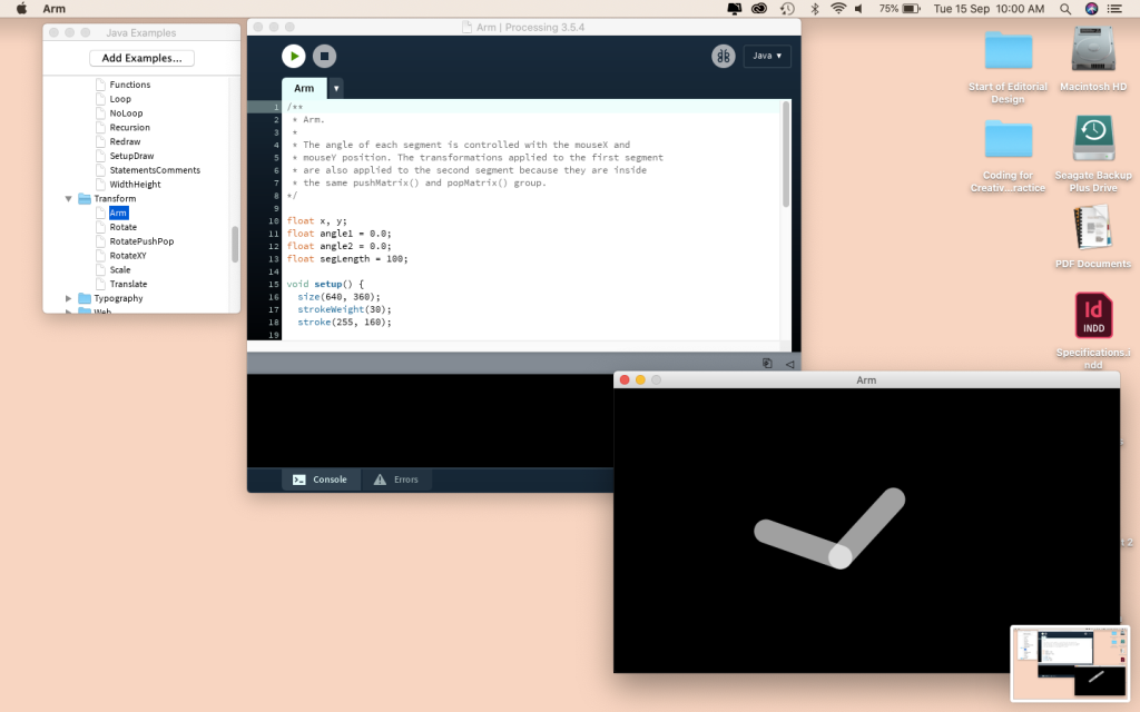
I quite like how you can move the arm but it will stay in place 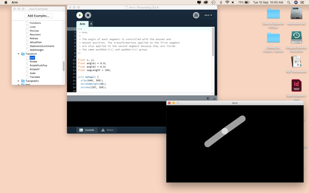
Reminds me of a robots arm 
This one created a gorgeous pattern 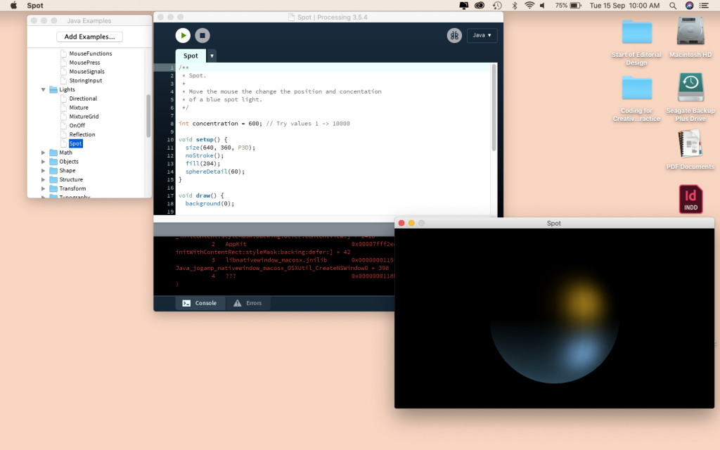
You can change the lighting by moving the mouse and the blue light follows 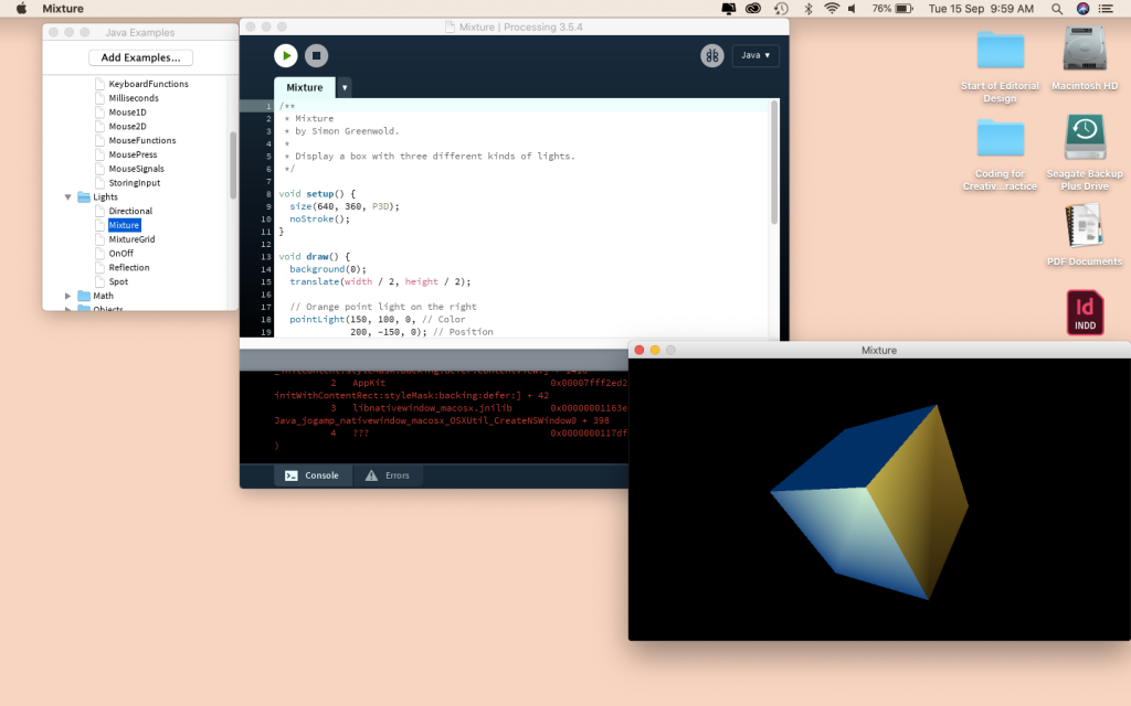
Change the angle of the cube to see the shadow change 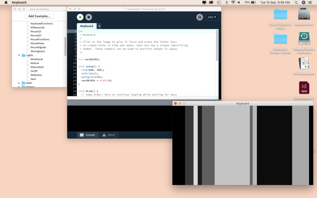
When you type it starts placing blocs 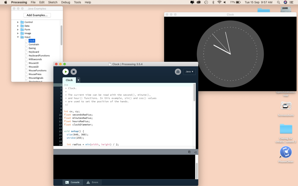
A clock. The arms move and it tells the right time 
These next 3 change the amount of triangles that are shown 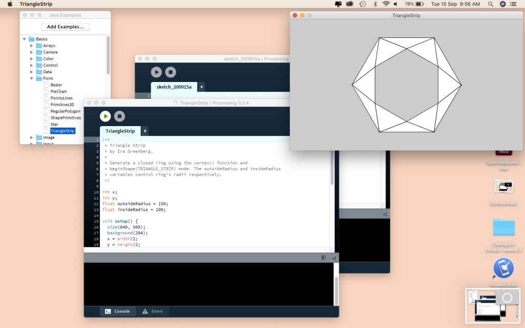
By moving your mouse from side to side 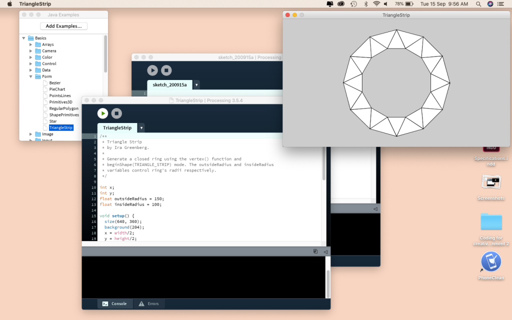
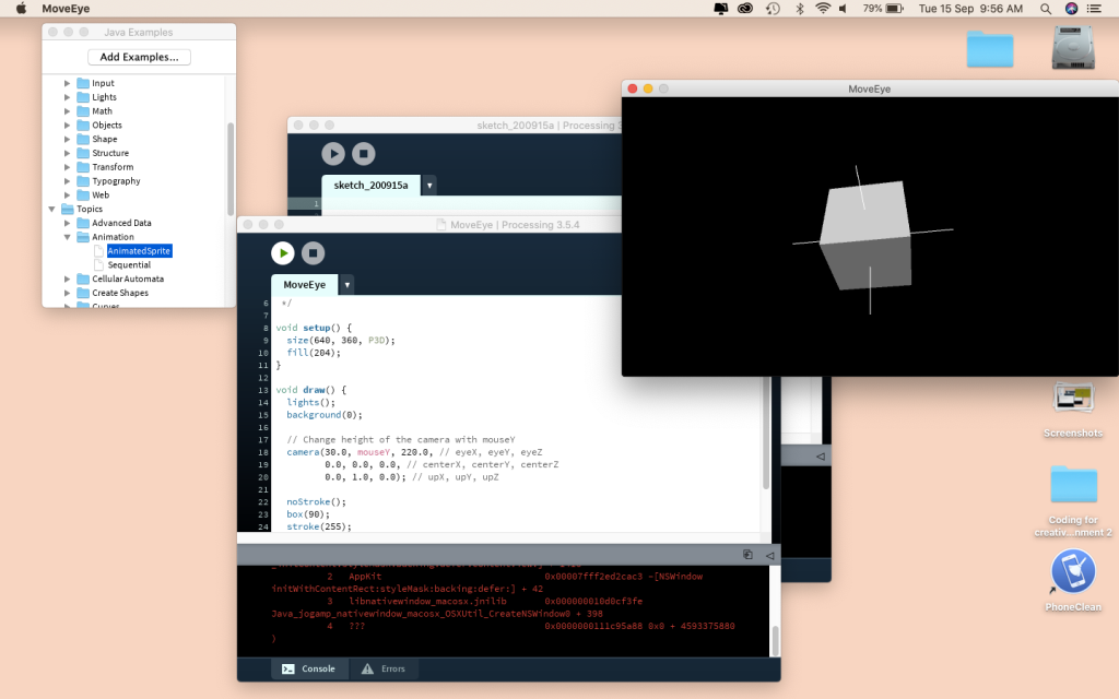
This one plays with the camera so you can move the cube
Design Examples –
For independent study, we were told to find a range of design examples that use different principles, methods and techniques to create an outcome. A lot of what I found was incredibly impressive, almost daunting but exciting. The amount of thought and effort and thought that goes into every detail is amazing. Generative design can be used in texture, generation, architecture, sculptures, posters, data visualisation and that is only the start.
“Generative art refers to any art practice where the artist uses a system, such as a set of natural language rules, a computer program, a machine, or other procedural invention, which is set into motion with some degree of autonomy contributing to or resulting in a completed work of art.”
Philip Galanter
https://www.plummerfernandez.com/works/customers-who-also-bought/
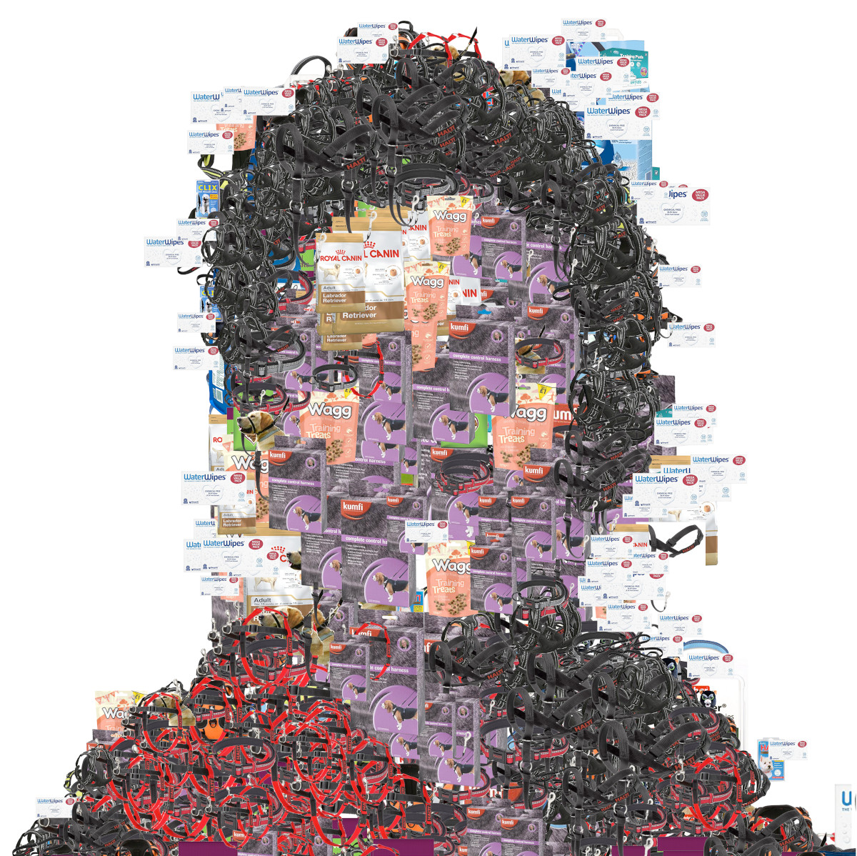
Customers who also bought is a series of portraits that are computer-generated by a system that scrapes Amazon for their recommended items that other “customers also bought”. These items, grouped together, can be seen as evidence as profiling, and how you as a customer, are being algorithmically profiled and classed a customer-type. The computer-generated portraits are representive of these abstract e-consumer profiles.
Matthew Plummer is a great designer who creates digital fabricated designs. His designs are creative and the end results are out of the box and every outcome is individual.What I like about this design is how he created a physical image of the person which makes it clearer to get the idea of “customers who also bought”. To enforce the idea that “customers who also bought” appears to be continuously changing the layers of different objects help with this and shows a popularity in different products and how they are always changing.
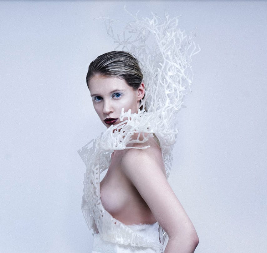
The 3D printed Bristle Dress by Bitonti Studio 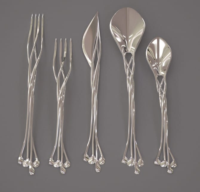
A 3D printed flatware collection designed by Bitonti Studio 
Incredible 3D printed shoes by Bitonti Studio
Designers can work with a synthesis of information and design parameters and turn it into design.
Francis Bitonti
Francis Bitonti works with 3D printing and creates clothing that has a flare and shows movement and shoes with gorgeous colour and even flatware that features intricate features creating a delicate set and a sense of usability.
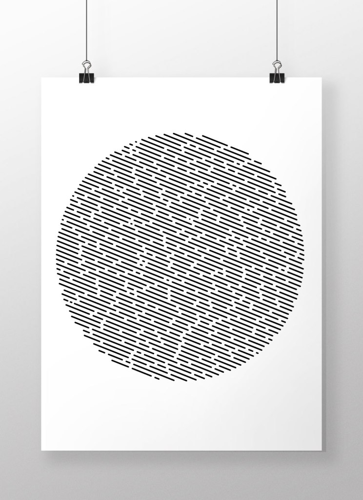
Made in NodeBox, Jacob Stanton created a set of rows using a range of parameters such as line spacing, number of lines and gaps. He then took the outcome and as a designer made the decision to take it into Illustrator to create the above.
The printed poster, the major medium for visual communication in public space for centurys, experiences fundamental transformations. The „Poster 2.0“ is much more than a surface with type, colors and images on it: It is an interactive application, animated, audible, data driven and intermedial. It involves all senses and disciplines. And it melts together graphic design with cutting edge technologies.
Tim Rodenbröker
Designer and educator Tim Rodenbröker developed more than 40 generative design-systems to showcase the visual possibilities of algorithmic graphic design. I love this design. It is interactive, plays with different senses and creates gorgeous outcomes. He has taken something that is typically 2D and has turned into so much more. I love the sense of movement, making the page come alive. It tells a story. There is a sense of depth and the repetition of colour links everything together making a series.

Although the typewriter isn’t an electronic device it is a mechanical device. It still uses a set of parameters in the right order to create a range of outcomes. Each order of the keys will create a different image.

Leeds Counselling is an organisation that specialises in the treatment of mental health issues using Talking Therapy. They asked us to produce press and posters to publicise the services they offer and to get people to their website. The individual lines that go to make up the portraits are genuine quotes from clients in counselling sessions. There are twenty quotes in total, repeated ad infinitum in an attempt to capture the turmoil of an unquiet mind. The headlines gently but firmly urge those with issues to open up.
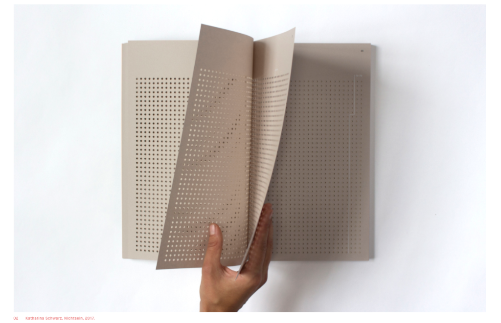
When designing for mental health, it’s easy to perpetuate tired metaphors—calming motifs of clouds or trees—or to approach the topic in more of a clinical and detached way. Berlin-based visual communication student Katharina Schwarz has purposefully taken a different tact for her MA thesis, a book of infographics pertaining to suicide factors and rates in Germany.
One of the most elegant and considered aspects of the book takes up nearly one third of it: a dense infographic representing the number of suicides in Germany in 2015, sorted by age. Each lilac page is skilfully pierced with holes, each one standing for one suicide, with faded white text guiding the reader to the accompanying information. Following this hefty section, the book is then divided into various chapters, each concerned with a different factor such as gender, income, marital status, or minority groups. Loneliness and depression aren’t shown in statistics; instead, Schwarz decided to include suicide letters and personal stories, all printed on heavy, bluish paper to distinguish them from the scientific parts of the book.
Madeleine Morley
I love this design. It makes you think and creates a glance into how each person was feeling. The whole thing is inspiring but heartbreaking. I appreciated that she looked into a range of social groups and made how someone might be feeling during these times into something with value rather than statistics.
When I started on this series of Design + Mental Health features, I’d assumed it would be fairly straightforward: I would speak to some designers about their mental health problems, contemplate how being a designer exacerbates them, and look at ideas of how agencies and clients can be more understanding of those designers affected.
But, like mental health conditions themselves, things weren’t as simple as that; they were knotty and complex, much like our minds.
“Mental health is serious, ugly, and deadly…”
Emily Gosling

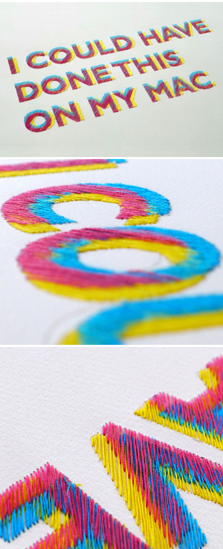
Utilising a combination of un-conventional materials applied using labour intensive digital embroidery techniques, ‘Oddity’ challenges not only material use within embroidery but also re-imagines the use of a typically commercial piece of machinery
I love the colours and the different use of materials. The contrast is beautiful and there is a sense of flow and movement across the fabric.
