Week 12

My computer decided to run extremely slow just before hand-in so I was stressed and felt like a headless chicken. I need to start designing how I want to use the data in the real world. I had suggestions for posters, stickers and cards. Over the years, cards have meant a lot to me when I am going through a rough patch. It can be easier to put feelings down into words and getting letters can make your day as it is full of love, positivity and it means someone was thinking about you even though you feel alone.

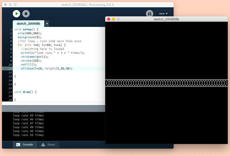
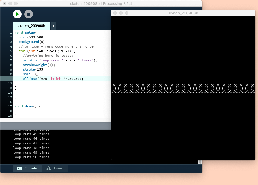
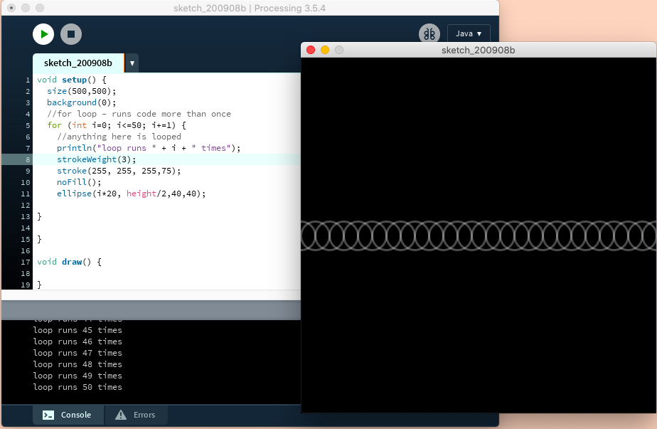
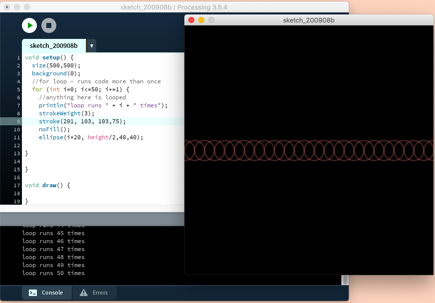
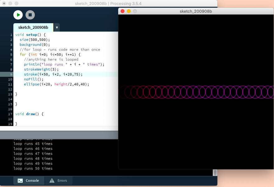
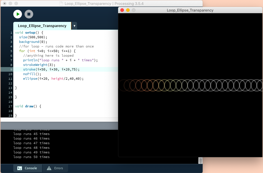
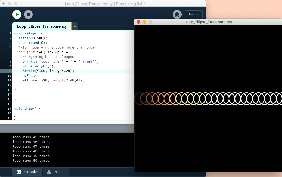
I first place in all the answers. As much as I love the colour it feels a little overwhelming so to break it down I decided to focus on one answer at a time. This could be using just one part on an answer or all of it, depending on length. I next started working on placement and colour but I decided that the colour dots stand out better against white. I next looked it how I could translate the answer and explain the question. I decided to put this on the back. I wanted the translation so that people can feel the affirmation that has been given to them.

I also added an extra column into the spreadsheet with my name and word of affirmations project (both in full and as an acronym) to add as a logo and a signature as I found during research.

https://www.lifewire.com/parts-of-a-greeting-card-1077348 says:

“On commercially-produced greeting cards, the back of the card is where you’ll find the name of the greeting card company, logo, copyright notice, and contact information. When making your own greeting cards, you might want to include your name and date or a personal stamp or logo.”

Other examples:

Mockups

When deciding where I would want my design to be located, my first thought was I want them to be a reminder and I know that a place that people could use some affirmations are doctors offices and therapy offices/rooms. However, I wasn’t sure how to convey this message. I then thought about where do people often get cards from and that lead me to bookstores.
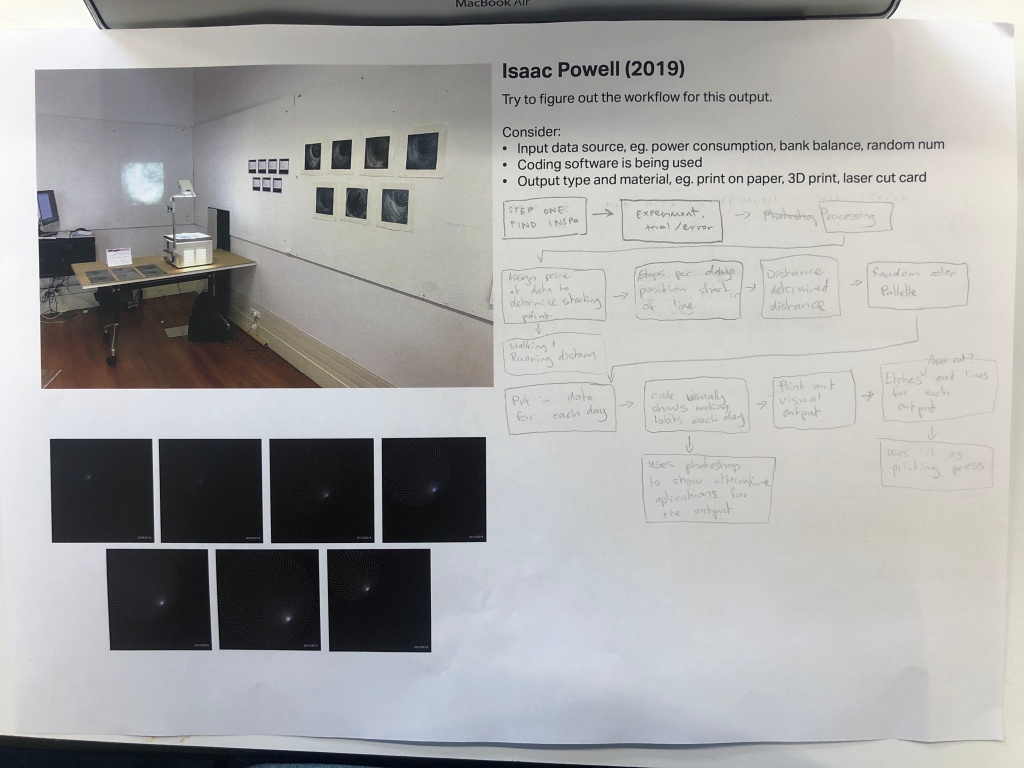
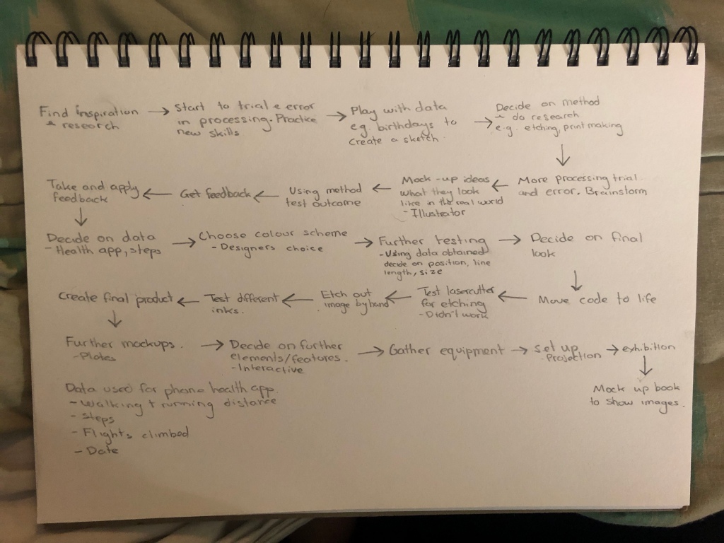
Workflow

Below are my two workflows. One I did in class the other at home as I wanted to make it a little more tidy and hopefully more explanation.

Final

I chose an answer from each question to make into a card to show some variety and to get a range of different answers for different questions.

It was cool to see what everyone had designed and it was amazing to see everyones hard work pay off and seeing skills develop.

Outputs

Questions and answers

What I did was take some of the different answers and showing them. As a part of a series it would be cool to see more of the answers on cards as they can help a range of people rather than just having a couple of answers that may not suit the situation.

What are some word of affirmations that you would you say to someone going through a hard time?
I understand what you are going through Want to go for a drive just because I am here for anything you need
You are strong You can do it Kia kaha Keep being brave
You are loved You are worthy You can do this
It is ok to feel overwhelmed We are here for you
Breathe Celebrate the good  Planning moves you forward
I can see that you are struggling Is there anything I can do
What are some word of affirmations that you would want someone to say to you when going through a hard time?
Want to go for a drink Want to hang out How are you really
I am here for you you can do this you are strong
You are loved You are worthy I am here for you Lets do this together
They are here for me That my worries are valid 
You are strong One step forward daily
I can see you Are having a rough time but remember we appreciate you
What would you want to tell your younger self? Any advice?
People will always let you down focus on yourself  do not wait for others Be the best version of yourself
One day at a time Keep asking for help It will get better
It does not get easier as you get older You need to form healthier habits now and deal with with your problems before they ruin your relationships and your health It is okay to ask for help
Keep breathing and take it one day at a time
Save Keep fit Choose happiness
You will get better at this in time
What would you want to tell your future self?
I hope you are better than me
It gets better
I am so proud that you got sober and reached out for help and recovery
Keep breathing and take it one day at a time
Enjoy each day Admire the outdoors Be kind
Remember the lessons I learned
What is a quote that you always replay when things get tough?
Will it matter in five years
She is beautiful piece of broken pottery put back together by her own hands And a critical world judges her cracks while missing the beauty of how she made herself whole again JM Storm
Everyone makes mistakes what matters is how you pick yourself up
All that I know is I am breathing now
I normally just go over the lyrics to my favorite songs
What is your name? This question can be left unanswered if you wish
Joshua
Bridget
Stephen Mills 
Camm
Comments or anything else you want to share?
Sometimes words are not necessary company and a hug can oftentimes be enough I feel guys do not get that sort of support as much as women
Thanks for doing this
Good luck with your project

Next Steps

To take this further, it would be cool to see all the answers as cards. I also would love for people to make their own using a website so that they can add their own affirmations depending on the situation as well as be able to read what others have said.
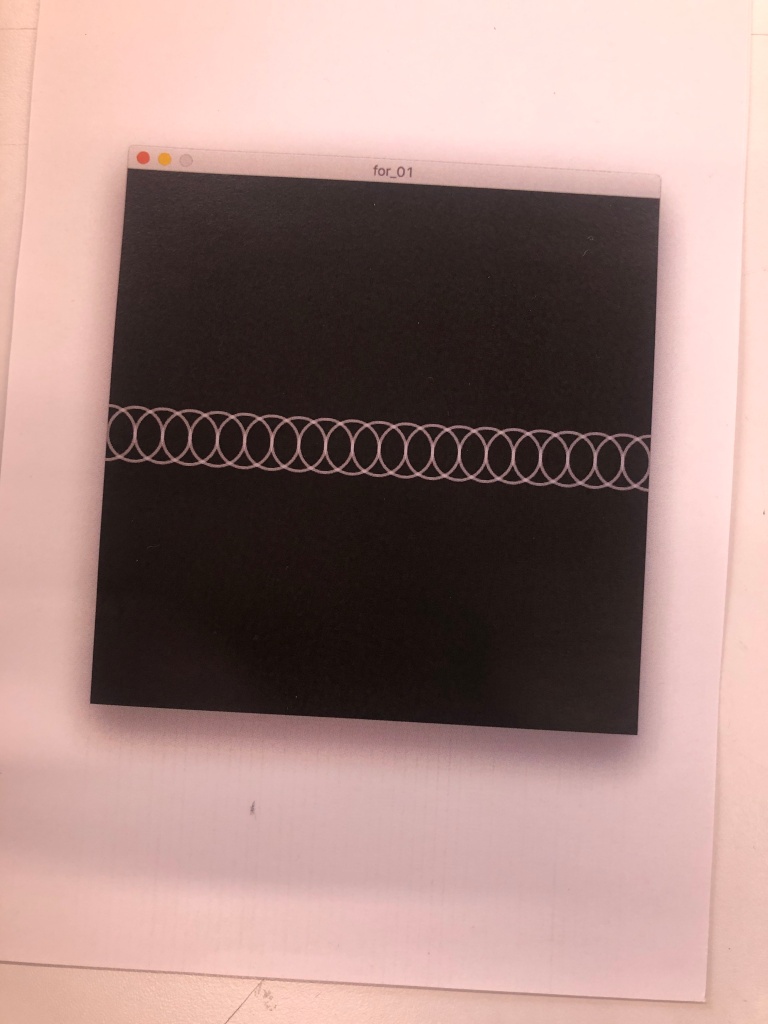
Code

I ended up taking the blending modes out as they only work in Processing.

import processing.pdf.*;
PGraphicsPDF pdf;

int maxHeight = 20;
int minHeight = 20;
int letterHeight = maxHeight; // Height of the letters
int letterWidth = 20; // Width of the letter

int x = 20; // X position of the letters
int y = 20; // Y position of the letters

boolean newletter; //true or false, tells the draw function if it should be creating ellipses

boolean saveOneFrame = false;
boolean drawFile = false;

int numChars = 26; // There are 26 characters in the alphabet
PImage[] colors = new PImage[numChars+1]; //array of images, 26 letters plus space
Table affirmation;

int headerNumber = 0;

PImage img; // Declare variable “a” of type PImage

void setup() { //runs once
pdf = (PGraphicsPDF)beginRecord(PDF, “wordsofaffirmation15.pdf”);

size(900, 700);
noStroke();
colorMode(HSB, numChars);
//blendMode(DARKEST);
//blendMode(MULTIPLY);
background(0, 0, 100);
saturation(200);
String alphabet = “ABCDEFGHIJKLMNOPQRSTUVWXYZ”; //list of file names

for (int i = 0; i < numChars; i++) { //controls the colours, loop happens 26 times, creates 26 values to the array, sets a hue value for each key
colors[i] = loadImage(alphabet.charAt(i)+”.png”); //starts at 0 = A and loads the file in
}
colors[26]=loadImage(” .png”);
}

void keyPressed() { //press space bar or any other keyboard button
headerNumber++; //goes to next header collumn
background(0, 0, 100); //background colour
drawFile = false; //if not drawFile draw
x = 20; //x position
y = 20; //y position
}

void draw() { //repeats
pdf.nextPage();

if (!drawFile) { //! means if not drawFile

String[] headers = {"What are some word of affirmations that you would you say to someone going through a hard time?", "What are some word of affirmations that you would want someone to say to you when going through a hard time?", "What would you want to tell your younger self? Any advice?", "What would you want to tell your future self?", "What is a quote that you always replay when things get tough?", "What is your name? This question can be left unanswered if you wish", "Comments or anything else you want to share?"};  

affirmation = loadTable("WordsofAffirmation2.csv", "header"); //load table, ignores header
ArrayList<String> allanswers = new ArrayList<String>(); // A string that has all the answers
for (TableRow row : affirmation.rows()) { //a new string starts a new row
  allanswers.add(row.getString(headers[headerNumber]));
}

for (int j = 0; j < allanswers.size(); j++) { //loop through the amount of times there are rows in the .csv
  String row = allanswers.get(j);//stores the row
  for (int i=0; i<row.length(); i++) { //goes through once for every character in the row
    String test = row.charAt(i)+""; //turns the character into a string 
    test=test.toUpperCase(); //makes sure it is a capital letter
    //img = loadImage(test.toUpperCase()+".png");  // Load the image into the program, detects that it is a .png  
    if (row.charAt(i)==' ') { //checks for space, that isn't in the alphabet
      img=colors[26];
    } else {

      img = colors[test.charAt(0)-'A']; //key is typed in, colour is accessed from colour array, string is 1 character long, needs to get the character from the string
      //println(allanswers);
    }


    processing(row.charAt(i), row, i); 
    if (newletter == true) { //checks to see if a letter is needed to be drawn and then draws the letter
      int y_pos;
      if (letterHeight == maxHeight) { //box of letter
        y_pos = y;
        noStroke();
        colorMode(HSB, numChars);
        image(img, x, y_pos, 35, 35 ); //controls image location and size
      } else {
        y_pos = y + minHeight;
        noStroke();
        colorMode(HSB, numChars, 0, 0, 100);
        println(x, y);

        image( img, x, y_pos, letterWidth, letterHeight );
      }
      newletter = false;
    }
  } //end of going through every character
  x = 20; //changes white space on left of sentence
  y+= maxHeight+35; //controls leading
}//back around for a new row
drawFile = true;

}
}

void processing(char letter, String row, int index)
{
// If the key is between ‘A'(65) to ‘Z’ and ‘a’ to ‘z'(122)
if ((letter >= ‘A’ && letter <= ‘Z’) || (letter >= ‘a’ && letter <= ‘z’)) { //converts letter to arrary (colour)
if (letter <= ‘Z’) {
letterHeight = maxHeight; //holds capital letters height
} else {
letterHeight = minHeight; //lower case letters
}
} else {
fill(255); //black
letterHeight = 30;
}

newletter = true; //boolean, true or false

int numberOfCharacters=row.indexOf(‘ ‘, index)-index; //Number of characters per row before going to next line
//prints the sentence, the letter that is being drawn right now, the number of characters that is left to draw in the word, println(row+” “+letter+” “+numberOfCharacters+” “+index);
x = ( x + letterWidth ); // Update the “letter” position
int endX=x+(letterWidth*numberOfCharacters); //x location of the last character/letter of the word

// Wrap horizontally
if (endX > width – letterWidth -62) { //-80 controls right white space
x = 10; //changes white space on left of sentence
y+= maxHeight+20;
}

// Wrap vertically
if ( y > height – letterHeight) {
y = 20; // reset y to 20 if it hits the bottom
}
}

void mousePressed() {
endRecord();
exit();
}

Week 11

Moodboard

I started at looking at ways people have used dots and code such as morse code in their designs. I also looked into positive, get well soon type cards as well. I liked the ones that were funny as during times you need a get well card something funny can make a difference. The colours are inviting and make me feel happy.

Further Variations

Above I started to play with inserting my new images for each letter. I also tested the PDF function. It worked but for some reason it would also produce a lot of extra pages. It took a little bit of fiddling to get the images to work how I wanted but after some playing with size and positioning I got it to work. I like how it has a roughness to the edges of the letter, it creates a more handmade style making it feel more personal and that thought it was put into it.

Tim suggested that I play with blending modes in Processing as this saves me having to do it manually in another program. Some of the blending modes work, some create a almost glitch effect and some make everything disappear. To add a space between the words I also created a white image for the space and as it isn’t transparent the effect gets applied to it and it turns it into a new colour. I don’t want the space to show like that so I need to change that to a transparent image. Which is also why when I played with different sizing some of the ellipses have a almost white square sit on top of it.

My next steps were to looking at colouring so I played with tint, I originally wanted to make the colours a little brighter but I couldn’t find the right function or place to do this so I thought maybe tint would help. In the end I decided that having different colours was better than having a tint of one. I also wanted to work on the leading so that it was clear where the different answers/sentences start and where they end. I also wanted to make sure that when a word ends the edge that it doesn’t “hyphenate” but takes the whole word to the next line. Along with this I wanted to add some white space to the right side as some of my letters were getting cut off. I decided on using darkest and multiply for my blending modes and the last few images are me showing the blending modes on the different set of answers.

Final output with with hand drawn images, without any changes made to it. Where I was about half way through before making them overlap and blend.

Update

Believe it or not this is the code with the blending mode… For some reason when it came to making the code a PDF it wouldn’t have the blending modes… I tried this many times and googled the problem and it is known but there doesn’t appear to be a solution at present. I also found that sometimes my pdf would glitch and little parts will disappear but I will try solve this.

Week 10

I completely forgot about creating mockups so just before class I made some. I would have wanted to do more but I started to run out of storage and kept getting the popup telling me so.

MockUps

Running low on storage so I need to deal with that but I managed to create a couple of mockups before I got the popup message relating to storage. The pages with the ellipses that take up half of the page are the answers to one questions and the full page is all the answers.

My set up
The notes I provided with my code

This idea of using ellipses have been done before so I wanted to take my own spin onto it. I love the use of colours and the promotion of positivity that the colours create.

Left page notes:

  • Create your own hand drawn colours for each letter and save them as individual pngs
  • Do capital letters be different size to the lower case letter?
  • Can you highlight some of the key words?

With the feedback I got, I started working on creating my own letters.

The first thing I did was start to play with different brushes in Procreate. I named them as I used them when I remembered to label them. I wanted a reasonably round brush, I didn’t mind a rough edge as it gives you a more imperfect hand drawn element to it. I also wanted there to be some overlap and with the overlap I wanted to make sure that when the letters overlapped that there was some blending to the different colours. I decided on using the big water brush. To create a more solid and brighter colour I overlapped the letters on top of each other but I knew that if I wanted there to be blending that I can apply.

Week 9

I was away this week so I kind of did my own thing. In class they focused on entourage and context.

Context is the environment or setting something is in and often helps describe function or use. A typical way of describing a context visually is through adding entourage; animals, plants and people all help give a sense of scale. Placing your creation into a scene can achieve this too.

The main thing is to communicate what your creation does, what’s it for? where? when?

You can get imagery of people, places, objects, etc to use as entourage by taking your own photos, or by finding them online.

Tim, taken from Stream

With this information I started by creating a list of contexts where you could see my output.

Entourage & Context Ideas:

  • Posters and print
  • Book
  • Bus ads
  • Phone cases
  • Stickers
  • Website
  • Flyers

The next thing I wanted to look at was what my creation does, what and who is it for, where, when.

I want my creation to be a positive reminder in what can be a busy, dull day. I want it to be something that grabs someone attention, possibly through colour, something that grabs their attention to hopefully pull the viewer out of their funk that they may be in or just a nice, friendly reminder. It isn’t for anyone in particular. I want it in places where it is easily visible and with things such as posters it can be up for a period of time which can be a daily reminder. I am unsure as to where some of my other context ideas would be available but somewhere accessible, possibly universities, a website where people can add their own words of affirmations as well as view what others have said and hopefully be able to order their own books or flyers etc.

My idea

Back in week 1 when we got to see examples of past work, there was one that I really liked. It was made by Calvin Lai (http://calvinlaicreativecoding.blogspot.com/). He had taken fairy tales and turned each letter into a colour ellipse. The colours, simplicity of the white space, the creativity that grabbed my attention. It is a beautiful design.

I want to be able to take this idea and using my own data and make sure that I understand the code that I am using and turn into my own.

I know that I want to take something to do with mental health and turn peoples pain into something more bright. I originally looked at suicide rates but what I didn’t want to do was take something that is serious and not glorify it by making something beautiful and creative so I decided against this. This then got me to my next idea which was what would help someone going through a hard time. I wanted to get this data from people who battle with mental health. Using Facebook, I asked a group that I am apart of some questions.

Description:

I am currently a design student at Massey. This semester I decided to take a coding for creative practice paper and for my project I want to look into words of affirmation. The aim of the project is to explore the use of computer programming as a creative tool in relation to art and design creative practice.

I am hoping to take your answers and turn them into something beautiful. Dealing with anxiety, I understand how much kind words can add a bit of colour into your life.

If you choose to take part, your answers will be anonymous unless you would like to be named.

Questions:

  • What are some word of affirmations that you would you say to someone going through a hard time?
  • What are some word of affirmations that you would want someone to say to you when going through a hard time?
  • What would you want to tell your younger self? Any advice?
  • What would you want to tell your future self?
  • What is a quote that you always replay when things get tough?
  • What is your name? This question can be left unanswered if you wish
  • Comments or anything else you want to share?

I did manage to get a couple of results which was great and exciting. The first thing I did was play with text in processing.

What is good about the video is you can see that I managed to get a typing effect going in println. As great as this is, it’s not quite where I want to type or where I want to type to show. I don’t mind if it typed on the run screen and the println but with it just being on the print line it currently can’t be saved as a PDF for me to then be able to take it to the next step. However, I am glad that I did manage to get some sort of type going.

X, Y location I find difficult to use as I can’t actually see the X, Y points to be able to work out so I kind of have to imagine it and then hope for the best. However, because of this half the time it doesn’t do what I want it to do and it does the almost opposite. Other times it works how I want it to. I added the notes to help me work out what each function does so the surprises are less common.

  • The string holds the set of text using the parameter ‘s’
  • Text size controls the size of the text
  • Text align controls how the text sits when the words go over two lines
  • Text controls what text is shown (in this case ‘s) and the it controls the box of text size and the placement on the screen

I next moved to wanting to be able to type on the screen.

Above I tried to type which worked but once it hit the edge of the page the typing stopped. I do like that I have it going even if it is not exactly how I want it to be and I also like how it is easy to read.

Another variation where I got the typing to work and I was able to continue typing however this time it moves to off the screen and only types in the one bottom corner. Just have to add it all together to do what I want it to do. At the moment my purpose of being able to write is if I am unable to add and load the table with my data into processing that I can at least type it in.

Above was my first go at importing my table into Processing but when I pressed run it didn’t show anything because I hadn’t set anything up so I decided to confirm that it was working through println which showed all of the answers that people had filled out. I found this exciting as I had just accomplished my first step. The next step is to have the text show on the screen when I press run.

I managed to get the text to show even if it was just one word at a time and really quick. This tells me that I am visually able to show the text. I would like to be able to slow the text. and then I want to work on placement and adding the colour ellipses.

Still shows one word at a time but at a slower pace

I decided that I wanted to be able to work out how to show more than one word at a time. I also want to start adding in the ellipses.

I decided not to worry too much about the text right now as I want to be sure that I can also do the colour ellipses for the different letters. I am happy with my progress so far but I feel that there is a lot to do for it to work.

So my next steps and my main goal for my project are the colour ellipses which at this stage I am unsure as to how to do it so I decided the best place to start is to just do it. I got carried away and didn’t screenshot my process to get to where I did below.

Close Up

Above you can see where I found what I had learnt about typing had come into play. I managed to get each letter to be a different colour and when it comes to capital letters, a different shape. I like that the colours are bright, they grab you attention and provide a positivity vibe which I am hoping for. This can be altered with HSBA (Hue, Saturation, Brightness, Alpha) if I need to. The capital letters are still the wrong shape as they are oval and overlap the letters that are on the line above which makes it hard to read.

I played with finding the right line height, letter heights and shapes to produce and outcome that I liked. I did like how the capitals are clear that they are capital letters but because they are so much bigger than the lower case letters it kind of grabs your attention and I find it hard to read and look at the different variations of size. This may change when I change the sizing but at the moment it hurts my eyes.

Above I started playing with sizing and accidentally made them just a tad to small… I then decided to just move onto adding my data into processing. I knew at this stage what controls the sizes and that I can type it in so if I can’t insert my data/table at least I can now type it in manually.

Here you can see that I managed to get my data table working in Processing! To confirm that it was creating the ellipses using the data I provided and not just creating ellipses I ran println which is spitting out everything in the spreadsheet. At the moment I haven’t set colours for each of the different letters but I can use the data in Processing (woohoo!)

The next step is to add colour and have a set colour for each letter.

The colours work
I started playing with the x and y locations and it created a chaotic mess

At the moment, there is a lot of colours and as much as it creates a bright, positive idea it is a little hard to lock at for long and is a little overwhelming. To help break some of this up I decided that it could help if each question has their own page. I thought that it might make it easier to change questions but using the mouse pressed function to move to the question and show those answers.

After I had separated the questions I started thinking about what I want to do with this code and what output I might want.

My first thought was a book that has the questions (which I decided didn’t need to be shown in the code so the headers/questions were ignored) and the answers in a book. The book being something that people can read and see a range of questions and see the positive answers. Having these answers being words of affirmations the book will be good for people who need affirmations during a hard time. With different questions it can help with different situations and reassure people of different things. I want these to be available in stores (bookstores) or even doctors and therapy offices for easier access to those who may need it. At the moment it is almost impossible to read unless you know what each letters colours are. For this reason I wanted to add some text on top of the ellipses with the letter so that people can read the affirmations.

Above is my first layout. Each page has all the answers to one question. You can see that I added text over the ellipses but quickly came to the conclusion that having to manually do this was going to take a lot of time to position each letter so that it is the same throughout as well having to go through and add a letter for every ellipse. I either need to find anyway to add text or find away to get the message of ‘words of affirmations’ to be clear.

Week 8

In class, we got to play around with for loops and variables as well as being introduced to how we can enter and insert data with processing. This was a really helpful class and gave me the skills to do the next steps. I am not quite sure at this stage what I want to do but I have a rough idea of a direction I would like to go in.


Week 8 Notes

  • How to enter data to processing: 
    • First attempt is done by hand, needs contact updating, if one parameter has been changed it will cause problems
    • Int is for full numbers
    • Int keeps variables in one place, easy to modify, not the most efficient, still needs to be hand written, takes time
    • Array: is seen throughout different coding, used for storying multiple variations 
    • Float = numbers with decimals
    • String = letters and words
    • Bolean = true or false 
    • 0 will grab the first number in the array so it goes 0,1,2,3,4,5 etc. It will draw as many as in the array
    • PDF is used for poster, laser cutting, vinyl and plotting to name a few
    • Oneframe works for PDF
    • Convert google docs/sheets to something that processing understands which is .csv (most common), .tsv
      • File, download, .csv 
        • it is case sensitive, create data folder (lowercase d), images, fonts go into this data files 
    • Table holds table data e.g. spreadsheets
    • Header tells processing that the first line isn’t data but is a header
    • State everything you need to do (workflow)
      • Weather data – excel – csv – processing – pdf – Illustrator – Laser cutter 

Idea Development – 

Pieces of advice

Taking peoples words and turning them into a picture. Converting words into colours, lines to create an image

Colour, stickers, book, digital embroidery, poster  

Words: Words of affirmation, what you want someone to say to you, what you would say to someone in the same situation as you, what would you want to tell your younger self 

Practice

What I like about processing is that there is a lot you can do with it but it can take some time to learn the language. To help me get a better understanding I continued to practice.

Data is from: http://archive.stats.govt.nz/browse_for_stats/snapshots-of-nz/nz-social-indicators/Home/Health/suicide.aspx#anchor5

Examples and Research

What is Generative Art?

Generative Art is a process of algorithmically generating new ideas, forms, shapes, colors or patterns. First, you create rules that provide boundaries for the creation process. Then a computer (or less commonly a human) follows those rules to produce new works. Artists may spend day or even months exploring one idea whereas generative code artists use computers to generate thousands of ideas in milliseconds. By instructing programs to run within a set of artistic constraints, and guiding the process to a desired result.

The process allows for more artificial unplanned fortunate discovery — the happy accidents and novel ideas that normally take time to stumble upon.

“The design process strikes a balance between the expected and the unexpected, between control and relinquishment. While the processes are deterministic, the results are not foreseeable. The computer acquires the power to surprise us.” 

MIchael Hansmeyer

“What I enjoy the most is the complex and intricate results you can get from a set of simple rules.” 

Anders Hoff
Generative Art by Manolo Gamboa Naon, an Australian artist who uses algorithmic tools including Processing to create art.

What I like about Manolo design is the use of layering of colours that mix together on the page creating a sense of depth. The colours are warm and inviting and I enjoy the sense of random movement and excitement of the circles.

Requires a lot of manual attention and care

https://tylerxhobbs.com/essays/2018/executing-generative-art-with-a-plotter

High quality acrylic paints, and keeping the paint in the tray thin and wet through frequent manual adjustment. For a paper, a thick mixed-media paper or even a textured paper specifically designed for painting.

What I like about Tyler Hobbs design is the amount of effort and time that would have had to go into this design. It is beautiful. There is a sense of flow and movement. The way that the colours start lighter at the top and get darker as they go down creates a sense of a landscape. The contrast draws you in and so does the repetitive shape that guide your eyes around the page.

Gyre 35700, a generative art work by Mark Stock. This piece is Stock’s reflection on the hierarchy of currents and eddies in the ocean, and their little-understood effect on global climate change. It is a 42″x28″ digital archival inkjet print on canvas (2012).

What I like about Mark Stocks design is that without knowing what data was used you know that this outcome has something to do with the ocean. This makes it effective, generating audiences that have an interest in this topic. The design almost appears to be moving as the paint mixes together. I love the colours and the rhythm that this design produces.

Jon McCormack, Fifty Sisters, Series of fifty evolved digital plant images using oil company logos as building blocks.

The “plants” were algorithmically “grown” from computer code using artificial evolution and generative algorithms. Each plant-like form was derived from the starting graphic elements of oil company logos.

The title of the work refers to the original “Seven Sisters” — a cartel of seven oil companies that dominated the global petrochemical industry and Middle East oil production from the mid-1940s until the oil crisis of the 1970s.

“I use evolutionary algorithms to create artificial life forms that would be almost impossible to design directly.”

 Jon McCormack

What I like about Jon McCormack’s design is the fact that he took something that already existed and turned it into something else to make a point. The scale makes an impact as the designs are hard to miss and play on the idea that the oil companies have made a large impact.

Georg Nees 1968 work Schotter (Gravel), one of the earliest and best-known pieces of generative art. Schotter starts with a standard row of 12 squares and gradually increases the magnitude of randomness in the rotation and location of the squares as you move down the rows. Imagine for a second that you drew the image above yourself using a pen and a piece of paper and it took you one hour to produce. It would then take you ten hours if you wanted to add ten times the number of squares, right? A very cool and important characteristic of generative art is that Georg Nees could have added thousands more boxes, and it would only require a few small changes to the code. Back then, computers typically had no monitors, and the work was shared by printing the art on plotters, large printers designed for vector graphics. 

What I like about George Ness’ design is the use of the simple shape being made powerful to show the effectiveness of generative art. Although there is randomness to the positioning, the use of repetition and movement as your eye follows the squares as they fall down the page, is used to create a sense of chaos. Proving how generative art is effective when wanting to play with scale, rotation etc at a quick speed.


A series of Generative Art created using Code in Processing. Using the various Alphabets as well as words to create interesting patterns.
https://www.paridhidiwan.com/generative-art

What I like about Paridhi Diwans design is how he took something as simple as the alphabet and managed to turn it into something as beautiful as above. Depending on the letter, the font, if it is capital or lower case, colour, position, rotation, if it has used multiple letters and the amount of each letters used will create a different pattern.

Using the words that generative artists use to describe it. The creator scraped and plundered websites, pdfs and books made by contemporary artists using generative processes in their artworks in order to have enough raw text to start with. Then organising all of these words based on the number of appearances in the source and finally used them as an input for a flocking simulation in order to create this generative manifesto. http://doc.gold.ac.uk/compartsblog/index.php/work/what-is-generative-art/

What I like about Valerio Viperinos design is he took data about generative art and then made a generative art piece with that information. It is clear to see what words are used commonly and what people say about generative art. The contrast makes the piece easy to read and grabs your attention creating a powerful design.

Further examples –

https://inconvergent.net/thoughts-on-generative-art/

https://www.artnome.com/news/2018/8/8/why-love-generative-art

https://www.artnome.com/news/2019/8/25/breeding-paintings-with-machine-learning

https://art.daneden.me/

Week 7

Class started with looking at the second assignment and looking at past projects which was really cool to see. In groups we were each given a past project and tried to work out the workflow/steps taken to get to the final stage. This helps us to understand the use of different design methods, media and the specific requirements needed in order for them to work. My group looked at Isaac Powell’s project.

https://isaacpowell0.tumblr.com/

Below is what we came up with. I really liked what his final result was. He made it clear how his code was used to create something physical. At first, it was confusing but with a deeper dive and investigation, it became more clear. From first glance, it was unclear as to what the image was trying to show eventually we worked out that it was data that he took from his health app on his phone in regards to his walking + running distance, steps, flights climbed and that date. The painted series was a little unclear but once we found out that his data had been taken, etched and printed the image end results became a little more clear to understand but below is the data in black and blue. Each line length, position conspire with a set of data.

We next had a look at the examples that are on Processing which was a big help with exporting.

Done as a class

As a class, we looked at possible sets of data we could use and then bring into Processing. Keeping in mind of design principles as we work. We learnt about what different export files we need for different systems. We got to discuss different physical outcomes that we could use. Personally, I like the sound of digital embroidery and vinyl cutting. Having done printmaking before, etching like what Isaac did also seems fun and so did doing something like a poster or a book.

3D output:

3D print, water jet, laser cut, wax mould, origami, vac form, CNC mill, digital knitting machine, jacquard loom.

2D outputs:

Laser cut/etch, screen print, print – stickers, poster, template for carving, booklet , vinyl cut/plotter, embroidery, digital tattoo, pancake bot, dyeing.

Other:

AR, LED strip.

Physical coding = No 

PRINTING: 

Pdf (vector) – Can scale up and down

.bitmap (raster) 

jpeg, png, gif, tif (bitmap)

stl, obj, 3mf (3D print)

jan, jef, sew  (embroidery) – https://www.janome.com/learn/software-lessons/digitizer-jr.-version-3/what-are-the-embroidery-file-formats/

Processing has “example” folders. 

Processing has “libraries” that you can import. – HE.mesh, DXF export.3mf

Data set

Weather, temp, health, steps, heart rate, sleep pattern, screen time, covid cases, sport stats, earthquake stats, calories consumed, sales data, social media. Random, noise.

Design principles 

Contrast, movement (visual flow), scale and proportion , rhythm (repetition), balance(symmetry and asymmetry), perspective.

We got to have a go and try and make different images using the loop for function/for if statements.

for( init; test; update) – 3 parameters separated by “;”

for(int i= 0; i < 10; i ++  )

int i = 5; i <15 ; i +=2;

What I had a go at making – Reference Image

Coding Notes (from class) –

Physical output, taking the code outside of the computer

  • 1 piece of work plus blog
  • Discus where in the world you would see your design, what is its purpose? Photoshop it into where it would be seen. Is it a building or a repetitive pattern?
  • Creative code out in the real world
  • PDF (vector) vs bitmap (re
  • Vector is good for large
  • Go to examples in processing to see how to export a PDF
  • beginRecord (tell It what you want it to save as, name of file)
  • Saves in Processing Sketch
  • A PDF is scaleable without losing quality
  • mousePressed PDF code is good when you want them to interact with and then when the mouse is pressed it saves
  • Random book if to float can be replaced with your code
  • Go through them all and see what one works for you e.g. multiple PDFs
  • Check out Processing library
  • HE_Mesh for 3D, PEmborider for embroidery
  • .dst for embroidery
  • Create some data
  • Data set is an option
  • Colours and things can be chosen as a designer and from design principles
  • Do it with purpose
  • String is used for words

for (init; test; update) {
statements
}

  • Int can be written as I or another letter or word. This tells the code where to start
  • Test = number of times the code runs
  • Update = Everytime the for loop runs, go up one (I++ or I+=2 will go up 2 at a time)
  • No delay in the loop

Possible idea –
Turning pain into beauty (mental health). What shape resembles mental health/illness. Tell a story through code

Processing Examples –

I decided to have a play around with the examples in Processing. I love what can be done in processing and that it provides examples for you and provides you with an explanation but a lot of the code I am still not sure I understand but that will come with practice.

Design Examples –

For independent study, we were told to find a range of design examples that use different principles, methods and techniques to create an outcome. A lot of what I found was incredibly impressive, almost daunting but exciting. The amount of thought and effort and thought that goes into every detail is amazing. Generative design can be used in texture, generation, architecture, sculptures, posters, data visualisation and that is only the start.

“Generative art refers to any art practice where the artist uses a system, such as a set of natural language rules, a computer program, a machine, or other procedural invention, which is set into motion with some degree of autonomy contributing to or resulting in a completed work of art.” 

Philip Galanter
customers-who-also-bought
https://www.plummerfernandez.com/


Customers who also bought is a series of portraits that are computer-generated by a system that scrapes Amazon for their recommended items that other “customers also bought”. These items, grouped together, can be seen as evidence as profiling, and how you as a customer, are being algorithmically profiled and classed a customer-type. The computer-generated portraits are representive of these abstract e-consumer profiles.

https://www.plummerfernandez.com/works/customers-who-also-bought/

Matthew Plummer is a great designer who creates digital fabricated designs. His designs are creative and the end results are out of the box and every outcome is individual.What I like about this design is how he created a physical image of the person which makes it clearer to get the idea of “customers who also bought”. To enforce the idea that “customers who also bought” appears to be continuously changing the layers of different objects help with this and shows a popularity in different products and how they are always changing.

Designers can work with a synthesis of information and design parameters and turn it into design.

Francis Bitonti

Francis Bitonti works with 3D printing and creates clothing that has a flare and shows movement and shoes with gorgeous colour and even flatware that features intricate features creating a delicate set and a sense of usability.

Made in NodeBox, Jacob Stanton created a set of rows using a range of parameters such as line spacing, number of lines and gaps. He then took the outcome and as a designer made the decision to take it into Illustrator to create the above.

The printed poster, the major medium for visual communication in public space for centurys, experiences fundamental transformations. The „Poster 2.0“ is much more than a surface with type, colors and images on it: It is an interactive application, animated, audible, data driven and intermedial. It involves all senses and disciplines. And it melts together graphic design with cutting edge technologies.

Tim Rodenbröker

Designer and educator Tim Rodenbröker developed more than 40 generative design-systems to showcase the visual possibilities of algorithmic graphic design. I love this design. It is interactive, plays with different senses and creates gorgeous outcomes. He has taken something that is typically 2D and has turned into so much more. I love the sense of movement, making the page come alive. It tells a story. There is a sense of depth and the repetition of colour links everything together making a series.

Washington-based painter Tyree Callahan modified a 1937 Underwood Standard typewriter, replacing the letters and keys with color pads and hued labels to create a functional “painting” device called the Chromatic Typewriter.

Although the typewriter isn’t an electronic device it is a mechanical device. It still uses a set of parameters in the right order to create a range of outcomes. Each order of the keys will create a different image.

Auckland based artist & designer Briar Mark. She hand-stitched it all. Hilarious, and an excellent statement on craft vs. technology.
http://www.welovead.com/en/works/details/a29BglrA

Leeds Counselling is an organisation that specialises in the treatment of mental health issues using Talking Therapy. They asked us to produce press and posters to publicise the services they offer and to get people to their website. The individual lines that go to make up the portraits are genuine quotes from clients in counselling sessions. There are twenty quotes in total, repeated ad infinitum in an attempt to capture the turmoil of an unquiet mind. The headlines gently but firmly urge those with issues to open up.

https://eyeondesign.aiga.org/the-book-re-considering-depictions-of-suicide-through-infographics/

When designing for mental health, it’s easy to perpetuate tired metaphors—calming motifs of clouds or trees—or to approach the topic in more of a clinical and detached way. Berlin-based visual communication student Katharina Schwarz has purposefully taken a different tact for her MA thesis, a book of infographics pertaining to suicide factors and rates in Germany.

One of the most elegant and considered aspects of the book takes up nearly one third of it: a dense infographic representing the number of suicides in Germany in 2015, sorted by age. Each lilac page is skilfully pierced with holes, each one standing for one suicide, with faded white text guiding the reader to the accompanying information. Following this hefty section, the book is then divided into various chapters, each concerned with a different factor such as gender, income, marital status, or minority groups. Loneliness and depression aren’t shown in statistics; instead, Schwarz decided to include suicide letters and personal stories, all printed on heavy, bluish paper to distinguish them from the scientific parts of the book.

Madeleine Morley

I love this design. It makes you think and creates a glance into how each person was feeling. The whole thing is inspiring but heartbreaking. I appreciated that she looked into a range of social groups and made how someone might be feeling during these times into something with value rather than statistics.

https://eyeondesign.aiga.org/we-need-to-talk-about-how-we-talk-about-creativity-and-mental-health/

When I started on this series of Design + Mental Health features, I’d assumed it would be fairly straightforward: I would speak to some designers about their mental health problems, contemplate how being a designer exacerbates them, and look at ideas of how agencies and clients can be more understanding of those designers affected. 

But, like mental health conditions themselves, things weren’t as simple as that; they were knotty and complex, much like our minds.

“Mental health is serious, ugly, and deadly…”

Emily Gosling
https://www.artsthread.com/portfolios/oddity/

Utilising a combination of un-conventional materials applied using labour intensive digital embroidery techniques, ‘Oddity’ challenges not only material use within embroidery but also re-imagines the use of a typically commercial piece of machinery

I love the colours and the different use of materials. The contrast is beautiful and there is a sense of flow and movement across the fabric.

Three.js – Spinning Planets

After being inspired to do a space themed threeJs final, I learnt how to add in textures, control different functions and modify them to do what I want them to do as well as take something and put my own spin on it.

After deciding that I wanted my main focus to be on Earth and finding that just using the snippets felt like I wasn’t learning code and what threeJs can do, I decided to push it a little further. I did this by adding two meshes, one a jpg and one a png on top of each other to create layers. From there I wanted to have them spin at different speeds to make it clear that they were two different elements. I decided to have Earth spin slower than the clouds but still visible that it is rotating. Having the different meshes rotate at different speeds created a visually appealing loop. 

The next element I wanted to add were some stars which I created using the particles snippet. However, instead of having them spin around screen, I wanted them to stay in one spot and then I wanted them to twinkle. In the particles snippet you can have the particles change colour but I decided that having one colour worked well and then having the particles slightly smaller and then fade in and out of brightness created a nice twinkle effect and that added another layer to the final output and tied the space theme together.

I wanted to add in one more element as it was becoming more obvious that this was based in space with a black background, stars and Earth, I thought that having a moon would also be a cool idea. It took a while to play with the code to get the positioning of the moon correct but once it was it was easy to create the rotation.

A lot of the struggles I had with this program Tim was able to help me with. I struggled with adding two meshes on top of each other but Tim suggested making the cloud layer slightly bigger would fix the problem and it did just that. He also came up with the math code to create the brightening and fading for my stars. Thank you Tim.

You can view it here – //threejsplaygnd.brangerbriz.com/s/?id=8238 and I believe I managed to get the moon working.

Understanding the code –

Below is the code. There are image which has my notes explaining what it does and then my actual code and the images I used.

Code –

<!DOCTYPE html>

<html>

<head>

<meta charset=”utf-8″>

<style>

body {

background-color: #ffffff; 

margin: 0;

overflow: hidden;

}

</style>

</head>

<body>

http://threejsplaygnd.brangerbriz.net/js/three.min.js

http://threejsplaygnd.brangerbriz.net/js/Detector.js

<script>

if ( ! Detector.webgl ) Detector.addGetWebGLMessage();

var camera, scene, renderer; 

var geometry, material, mesh; //the different variables that are used. These also control the differnt aspects so I can do different things with them individually 

var cloud_geometry, cloud_material, cloud_mesh;

var moon_geometry, moon_material, moon_mesh;

function setup() {

var W = window.innerWidth, H = window.innerHeight;

renderer = new THREE.WebGLRenderer();

renderer.setSize( W, H );

document.body.appendChild( renderer.domElement );

camera = new THREE.PerspectiveCamera( 50, W/H, 1, 10000 );

camera.position.z = 500;

scene = new THREE.Scene();

//moon

                map = THREE.ImageUtils.loadTexture(‘https://lh3.googleusercontent.com/proxy/Knq3LMr0rgQKzbVDRM_S-f9jUzEqHN8tOWQU59BJNjoIjfYNeTE4mlaMb3wH1ZuVXQfjMoj_vVUtKenJmodYos-h&#8217;); //this loads the image using the imageURL

moon_geometry = new THREE.SphereGeometry(150, 100, 100); //this controls the size

moon_material = new THREE.MeshBasicMaterial({shading: THREE.FlatShading, color: 0xdcdcdc, map: map}); //this controls the colour, shading, transparency and opacity (if stated) of the shape

moon_mesh = new THREE.Mesh(moon_geometry, moon_material);

map.wrapS = map.wrapT = THREE.RepeatWrapping;

map.repeat.set( 1, 1 );

moon_mesh.scale.x = moon_mesh.scale.y = moon_mesh.scale.z = 0.39; //this controls the size

moon_mesh.position.y = 150.23; //this controls the X and Y locations

                moon_mesh.position.x = 180.23;

scene.add(moon_mesh); //this loads everything

//Clouds

map = THREE.ImageUtils.loadTexture(‘https://upload.wikimedia.org/wikipedia/commons/d/df/Earth-clouds.png&#8217;); //this loads in the image url to use as a texture for the shape

cloud_geometry = new THREE.SphereGeometry(150, 100, 100);

cloud_material = new THREE.MeshBasicMaterial({shading: THREE.FlatShading, color: 0xdcdcdc, map: map, transparent: true, opacity: 1});

cloud_mesh = new THREE.Mesh(cloud_geometry, cloud_material);

map.wrapS = map.wrapT = THREE.RepeatWrapping;

map.repeat.set( 1, 1 );

cloud_mesh.scale.x = cloud_mesh.scale.y = cloud_mesh.scale.z = 1.01;

scene.add(cloud_mesh);

//Earth

map = THREE.ImageUtils.loadTexture(‘https://steamuserimages-a.akamaihd.net/ugc/545263034473954343/68F4AB04814E6E57B78A848CEF3852476F0B00A8/?imw=637&imh=358&ima=fit&impolicy=Letterbox&imcolor=%23000000&letterbox=true&#8217;);

geometry = new THREE.SphereGeometry(150, 100, 100);

material = new THREE.MeshBasicMaterial({shading: THREE.FlatShading, color: 0xdcdcdc, map: map});

mesh = new THREE.Mesh(geometry, material);

map.wrapS = map.wrapT = THREE.RepeatWrapping;

map.repeat.set( 1, 1 );

scene.add(mesh);

//Stars

geometry = new THREE.Geometry();

for ( i = 0; i < 5000; i ++ ) {

var vertex = new THREE.Vector3();

vertex.x = 1000 * Math.random() – 500;

vertex.y = 1000 * Math.random() – 500;

vertex.z = 1000 * Math.random() – 500;

geometry.vertices.push( vertex );

}

material = new THREE.ParticleBasicMaterial( { size: 3, sizeAttenuation: false, transparent: true } );//this mentions the size of the star pixels

material.color.setHex( 0xff00ff );

particles = new THREE.ParticleSystem( geometry, material );

particles.sortParticles = true;

scene.add( particles );

//Background

bg = document.body.style;

bg.background = ‘#000000’;

}

function draw() {

requestAnimationFrame( draw );

//rotation cntrols the speed and the angle of which is rotates

cloud_mesh.rotation.x = Date.now() * 0.0000;

cloud_mesh.rotation.y = Date.now() * 0.0003;

cloud_mesh.rotation.z = Date.now() * 0.00000;

mesh.rotation.x = Date.now() * 0.0000;

mesh.rotation.y = Date.now() * 0.0001;

mesh.rotation.z = Date.now() * 0.0000;

moon_mesh.rotation.x = Date.now() * 0.0000;

moon_mesh.rotation.y = Date.now() * 0.0001;

moon_mesh.rotation.z = Date.now() * 0.0000;

var time = Date.now() * 0.0003; //size of pixel stars

h = (((Math.sin( Date.now() * 0.002 ))+0.75)/4)+.2; //controls the speed at which the star pixels fade and brighten

                console.log(h);

material.color.setHSL( 0.5, 1, h ); //colour of pixel stars

renderer.render( scene, camera );

}

​ setup();

draw();

</script>

</body>

</html>

Images –

The cloud image won’t show on a white page but you can click here to see the image or go here to the website – https://commons.wikimedia.org/wiki/File:Earth-clouds.png

https://steamuserimages-a.akamaihd.net/ugc/545263034473954343/68F4AB04814E6E57B78A848CEF3852476F0B00A8/?imw=637&imh=358&ima=fit&impolicy=Letterbox&imcolor=%23000000&letterbox=true

Earth website – https://steamcommunity.com/sharedfiles/filedetails/?id=348783119

https://lh3.googleusercontent.com/proxy/Knq3LMr0rgQKzbVDRM_S-f9jUzEqHN8tOWQU59BJNjoIjfYNeTE4mlaMb3wH1ZuVXQfjMoj_vVUtKenJmodYos-h

Moon can be seen here – http://solarviews.com/cap/moon/moonmap.htm

Video –

Processing – Ellipse Painting

The ellipse painting, I wanted to be able to create an image in the code 

For my space pixel painting set of code, I dragged and inserted my images to processing so that they are located in the data directory of the current sketch. I set up the screen size to be fullscreen and then I loaded in the different images so that they are ready to use. 

You start by setting up the variable name and tell processing what it is equal to and in this case you tell it to loadImage and then you put in the full name of the filename. For this project I used jpg and png for my different images. I also resized the images so that they fit the screen better. I set the background to black to resemble space. I also decided that I didn’t want the cursor to show unless the mouse is pressed. 

I wanted there to be two different parts to this code. One where people can watch something happen and another where they can take part and play with it a little. When the mouse is released it will show the image that is made out of ellipses in front of you. It will continue to add ellipses to the image creating a twinkling effect until the mouse is pressed. This has two functions. One it restarts the code so you can see it from the beginning and two it shows the image in full without ellipses and you can move the cursor around which is now a rocket ship. 

Understanding the code –

Below is the code. There is the image which has my notes explaining what it does and then my actual code and the images I used.

Code –

PImage galaxySpace3;
PImage rocketFire;
PImage spaceAlone2;

void setup() {
fullScreen();
galaxySpace3 = loadImage(“galaxySpace3.jpg”);
spaceAlone2 = loadImage(“spaceAlone2.jpg”);
spaceAlone2.resize(displayWidth, displayHeight);
rocketFire = loadImage(“rocketFire.png”);
rocketFire.resize(0, 500);
background(0);
noCursor();

}

void mouseReleased() {
background(0);
noCursor();
}

void draw() {
for (int i = 0; i < 75; i++) {
float x = random(width);
float y = random(height);
color c = galaxySpace3.get(int(x), int(y));
fill(c);
noStroke();
ellipse(x, y, 10, 10);
}

if (mousePressed) {
background(spaceAlone2);
cursor(rocketFire);
}
}

Images –

Video –

Conditional Design – Constellations

Constellations 

  1. Take turns placing a dot in the most empty space on the paper as quick as possible, using your chosen colour. For 3-5 minutes
  2. Connect the dots you made with a line that doesn’t cross the lines of another player. 
  3. These lines must be straight. Try complete this is in under 5 minutes
  4. Pay attention as you can have up to 2 lines coming off of one dot
  5. Each dot must have at least one line coming off of it
  6. You don’t have to only draw off your own lines and dots

This code gets people to think quickly about where to put the dots in the most empty space of the page. The lines which can be difficult to quickly add onto the dots gets people to think more about where they are going to place their next line. The end result makes up what looks like a constellations. 

The bright colours mimic the colourfulness of my other sets of code. I decided on white paper as the colours didn’t show on black paper and white makes the colours and the end result stand out. 

Final
In the exhibition
Feedback